In January 2018 AmericasMart launched a display of color-inspired interiors in partnership with the Pantone Color Institute™ and Flower magazine. AmericasMart’s signature vignette exhibition features the new Color of the Year, Ultra Violet, and PANTONEVIEW® Home + Interiors 2018 color forecast, where interior and floral designers boldly portray what’s ahead for 2018.
For the first time, each vignette interior designer is paired with a floral designer to create a space according to one of PANTONE’s eight signature palettes. Each space is brought to life by the product of a sponsor—incorporating other brands to round out each designer’s personal vision. The vignettes are designed to promote multiple product categories, lifestyles and really show the depth and breadth of product found at AmericasMart.
The Designers
Mallory Mathison + Laura Iarocci
Corey Damen Jenkins + Michal Evans
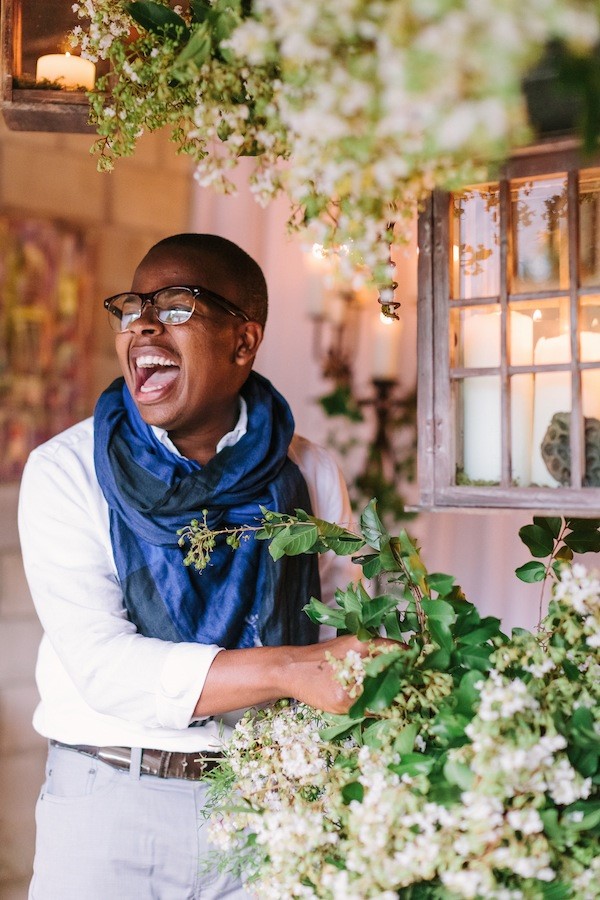
André Hilton + Canaan Marshall
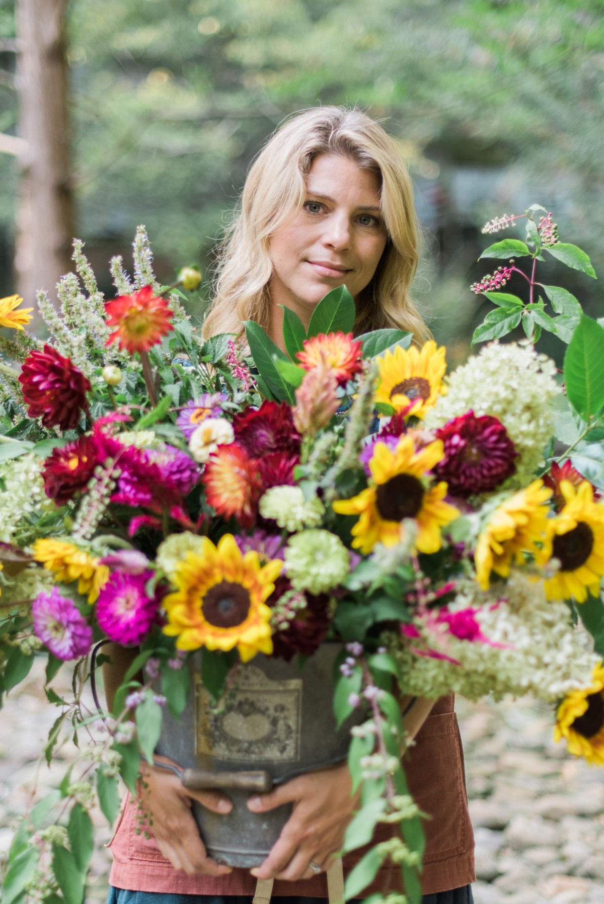
Brian Patrick Flynn + Holly Bryan
Margaret Kirkland + Parties To Die For (Tricky Wolfes/Kathy Rainer)
We asked three of the designers, “How do you approach color?”

“One of my favorite courses in art school was all about color theory. I am fascinated by how colors influence each other, how they intensify each other, how they seem to change from one moment to the next. I recently designed a wedding where the bride wanted all shades of purple. Purple is my favorite color so I was excited to use it, but I suggested we introduce a little bit of a soft golden wheat color to help the purple stand out. I love working with complementary colors! They are opposites on the color wheel, but really play well with each other. But if it’s an analogous color scheme my client wants, that is a wonderful opportunity to really focus on different textures and shapes and is equally as interesting for me.”—Holly Bryan

“I’m a maximalist when it comes to color. We live our lives wrapped in it and there are limitless combinations out there. So as an interior designer I aim to break as many rules as possible when it comes to manipulating color. Don’t get me wrong, I love a neutral, monochromatic scheme too, but I believe that vibrant, unabashed color is something to be celebrated. If it is used judiciously, color can be a powerful way to break barriers in design and decoration.”—Corey Damen Jenkins

“I rarely shy away from color in design. I seek out color in the details of a complete design concept that might otherwise go unnoticed. Elaborating on color lends the perfect opportunity to subtly bridge the details of a vignette with what the audience experiences.”—Canaan Marshall
