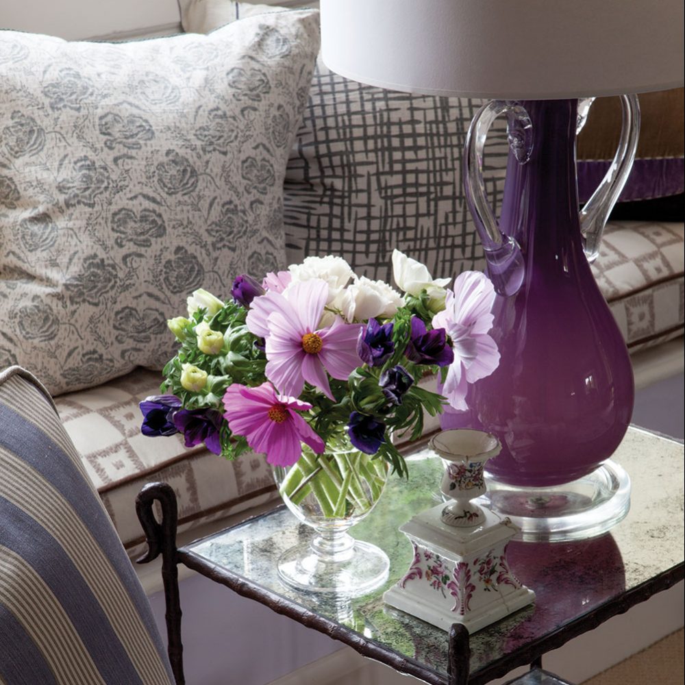
A summer sitting room gets the William Yeoward treatment with soft colors that are echoed in the hand-blown amethyst opaline lamp and mass of flowers in the crystal compote.
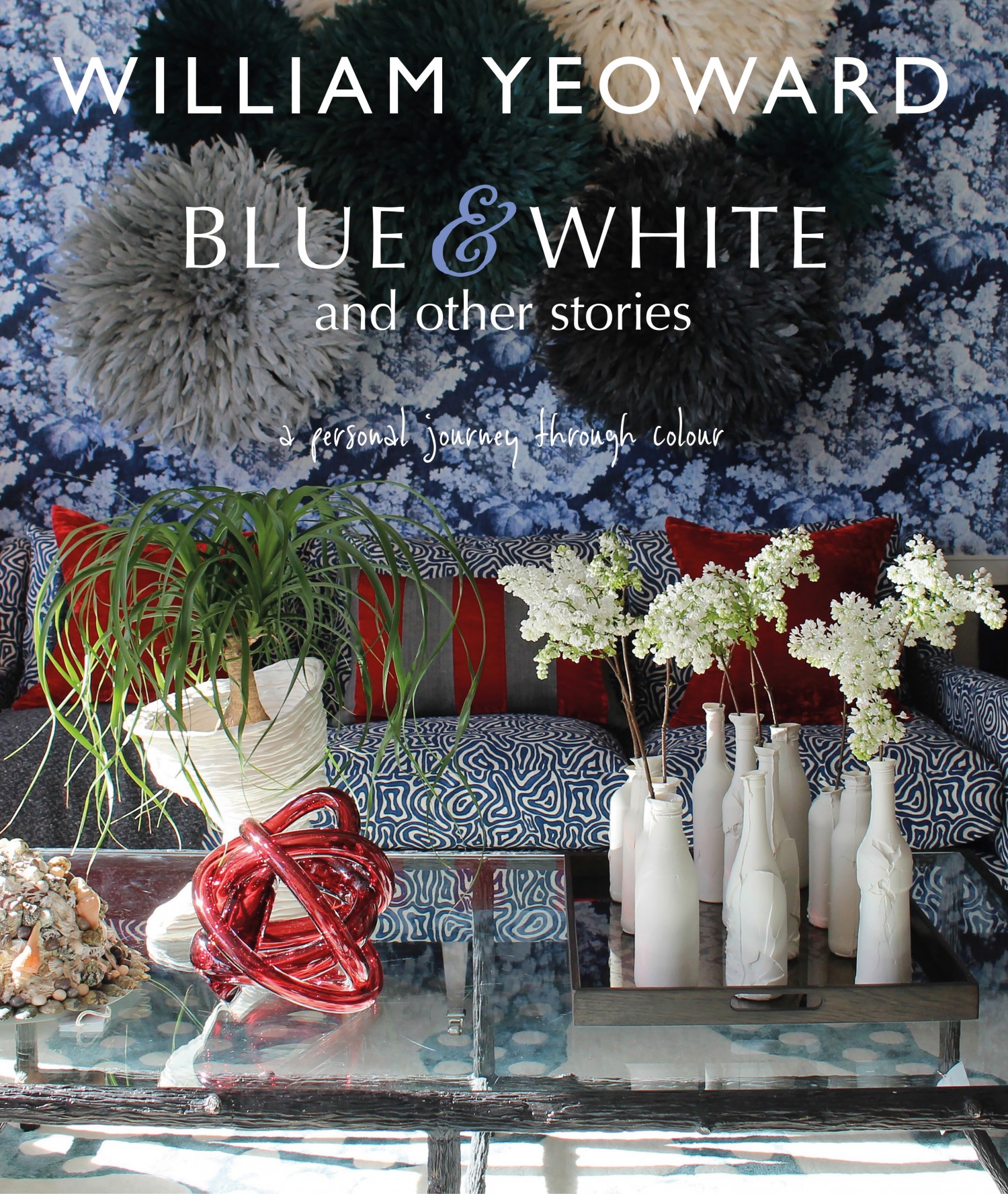
Leave it to William Yeoward to say something new about a topic that has consumed the pages of shelter magazines for decades—color. In his new book, Blue & White and Other Stories (CICO Books, 2017), the erudite British designer reduces the daunting subject to its essence: a tool to be used as an expression, a reflection of the self. He doesn’t proselytize about the dos and don’ts of decorating with color; instead he offers ideas and examples to mull over and then reinterpret for an individual space.
“Once you commit to color, you leave yourself open to interpretation,” he says. “It’s not about right and wrong. It really comes down to context.” Yeoward sets the color enthusiast free.
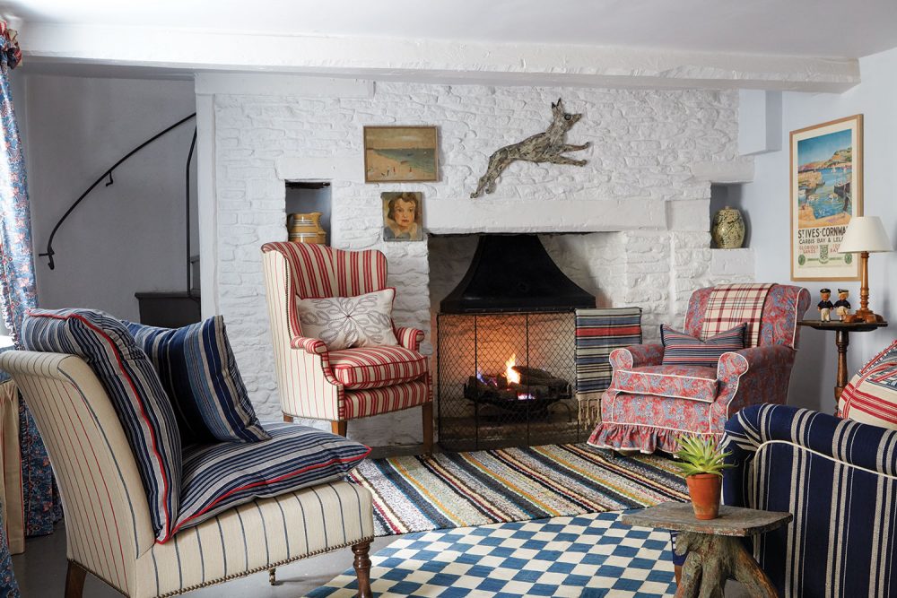
In his family’s seaside cottage, Yeoward reveals his practical nature and love of the eccentric. The colorful rugs and diverse upholstered chairs are so eclectic that the result looks intentional and stylish.
While discussions with the designer are delightfully lively, his interiors are stylishly livable. Attribute some of that to his upbringing. “Growing up, color came through in my family, in the characters—and it still does,” he says. Admire the reds, whites, and blues of his family’s modest seaside cottage. In design and decoration, color is his tool, signaling calm and exclamation in equal measure. “Everything in life has to have a punctuation mark,” he says. Yeoward’s cottage comes together with family heirlooms (think old potato box and cutlery, not fine Georgian silver) and striped cotton, linen, and wool fabrics that mix with such freedom that it feels intentional. In the book, Yeoward calls it “artfully not arranged,” which describes his instinctive touch in bringing together disparate objects.
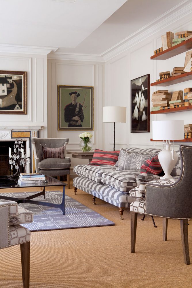
In a client’s living room, neutral grays and blues and traditional furniture might seem predictable, but when William Yeoward adds shots of red and tailored, smart upholstery, the room becomes modern.
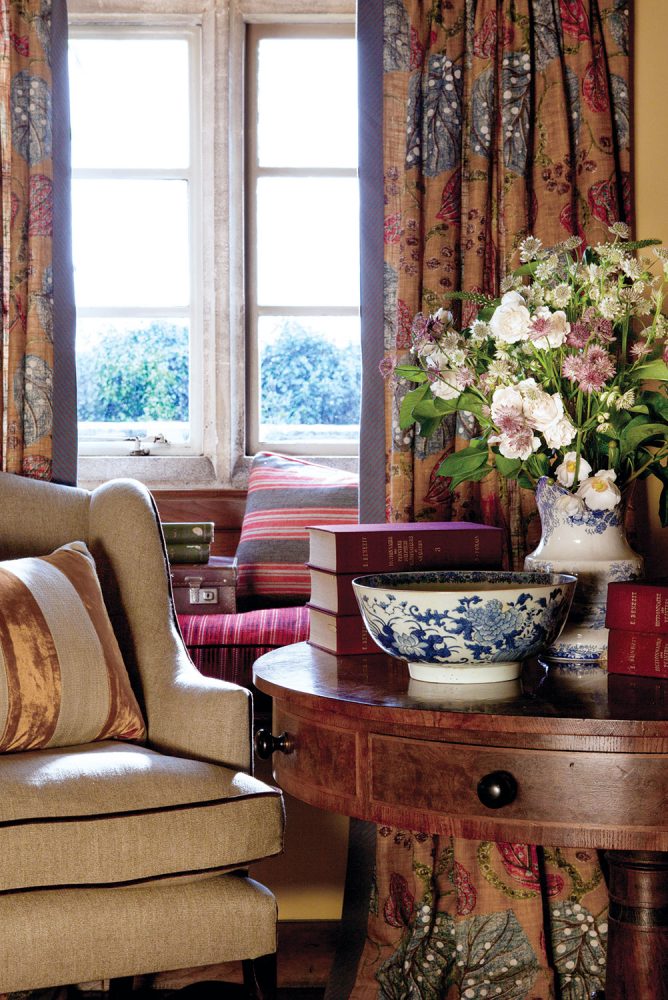
Yeoward’s floral-patterned fabrics and ceramics keep company with a massive bouquet gathered from the gardens beyond the window, bringing a sense of the timeless and the fleeting to a corner nook.
It’s that eye for the interesting, exceptional, and ordinary that inspires Yeoward’s way with color. At the beginning of each chapter in the book, he presents what he calls his “Instagram pages”—a grid of his own snapshots and moments that reflect his view of a color or color combination. They reveal the myriad color influences that surround all of us if we are open to them—a loaf of bread, a squash blossom, a piece of fruit, or a Pontifical Swiss Guard, to name just a few.
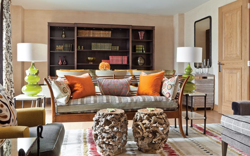
The living and dining areas share the same room in this city apartment. Yeoward combined midcentury and modern furniture with traditional materials, avoiding a cold modern or dowdy traditional feel.
When he’s not designing crystal, fabric, wallpaper, furniture, or interiors, Yeoward is working with other tastemakers on color forecasting. “I rely on my gut to say what color will be good in two years, for example,” he says. “But sometimes it’s too early. So there will be modifications and editing that keep the forecast on point.” He modestly chalks it up to instinct, but it’s also part of his mind’s eye, recognizing a shade, tone, or cast whose time has come or should come, whether it’s next season or next year.
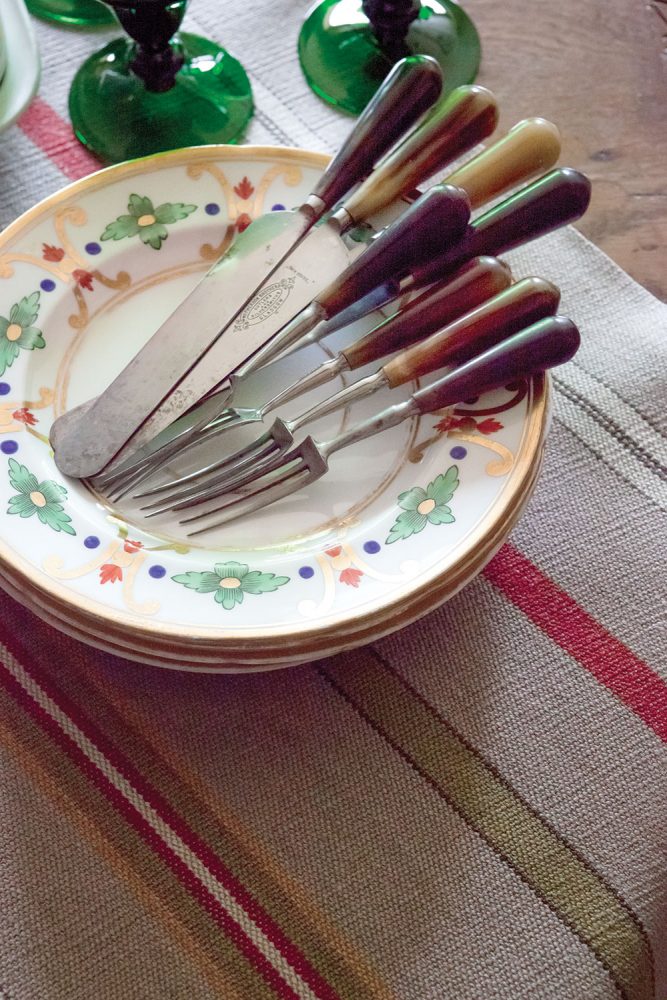
Antique horn-and-steel flatware lends rustic heart to an old Staffordshire plate.
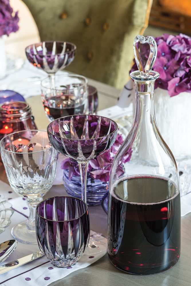
William Yeoward’s amethyst crystal walks the color line without being overtly masculine, feminine, or seasonal.
His most recent trip took him to Corfu, Greece. “It’s so lush and green and not like the Greece we see with whitewashed walls and blue seas,” he says. That trip influenced his work upon his return to England. “I’m not translating what I saw literally,” he says, “but how can my travels not influence me and become part of my handwriting, so to speak?”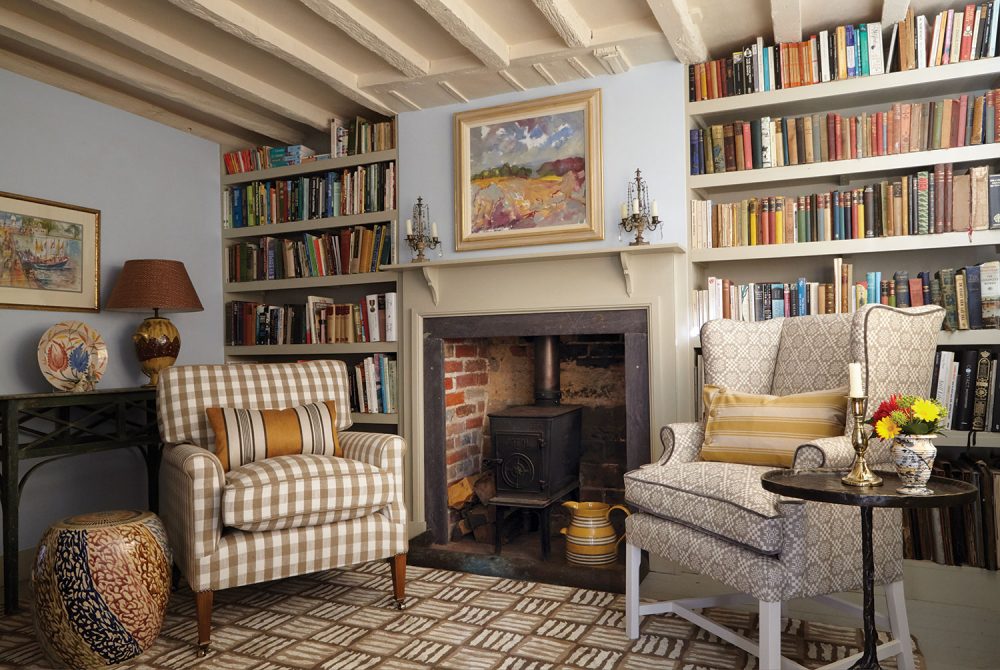
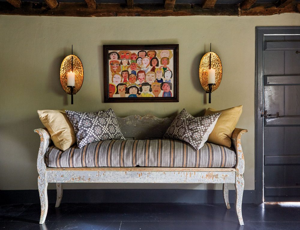
At the home of a schoolmaster’s family, Yeoward made the most of a collection of books, student art (the self-portraits over the sofa), and artifacts amassed around the globe. These objects—along with the injection of modern pieces, such as the copper sconces over the sofa, and interesting fabrics—allow the modest space to transcend its limits.
The designer’s color dexterity enhances his ability to create timeless interiors, but he acknowledges the challenges of time and trends. “Often I think, ‘There, I’ve made a classic.’ Five years later, I look at the same project and think, ‘It’s so out-of-date!’ To create timeless work is much harder than to create fashion.” Overall, he adheres to the philosophy of staying true to your own collections and tastes and the context of where you are.
He is also keenly practical when it comes to decorating, regardless of budget. He was an early—perhaps the earliest—practitioner of mismatching, whether it be upholstery, chairs, or china and crystal. “I had to,” he says. “Either I didn’t have enough to make a set or I’d busted a glass, and then it was just more fun and interesting to mix things up.” Clients and friends were not exactly on board initially. “They thought I was mad,” he says. “Now they get it.”
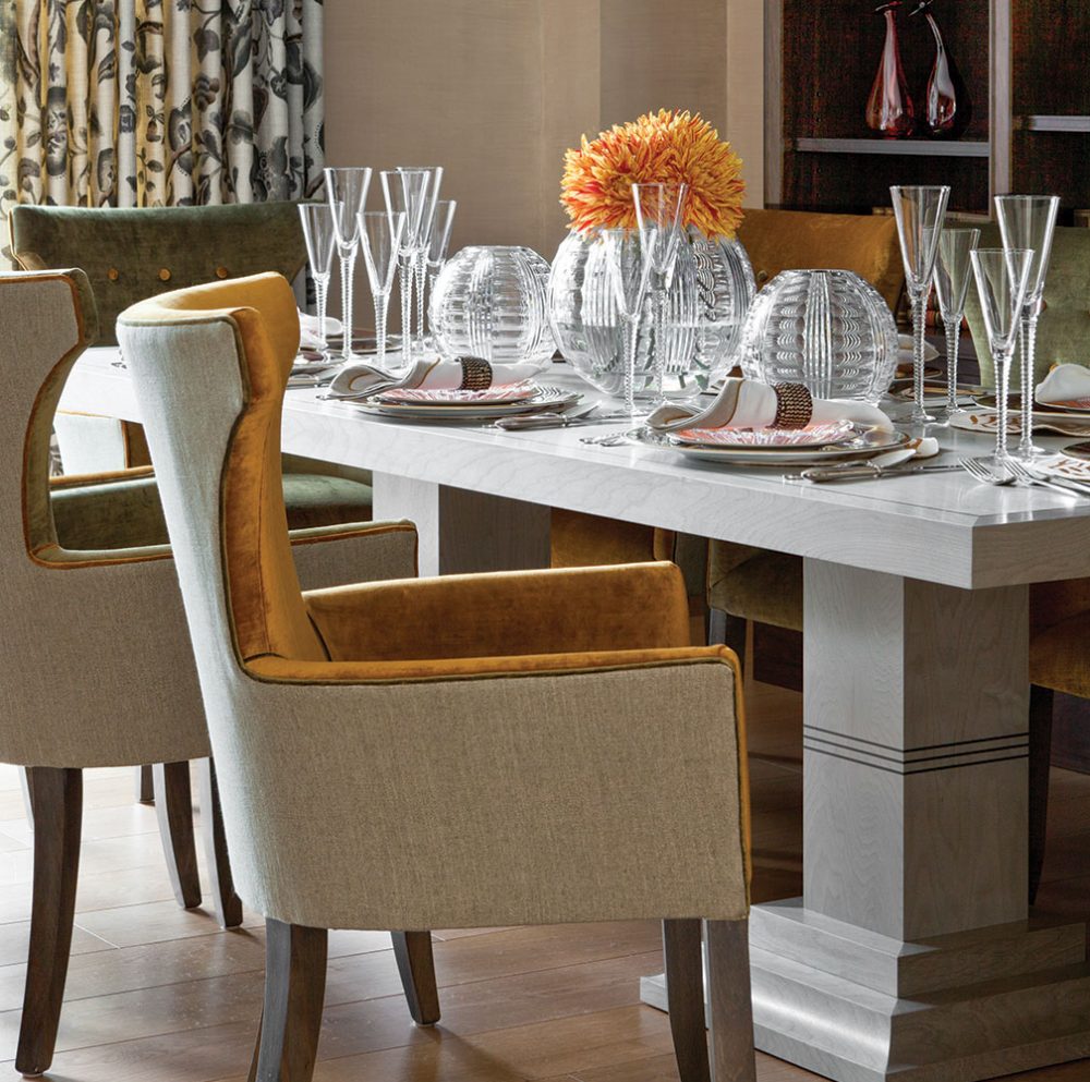
Yeoward notes that these smartly dressed dining chairs are as comfortable as they are good-looking.
Similarly, he gets creative with upholstery: “We’re thrifty when we have to be and use the bits.” The result is more compelling than if he had been more profligate with the fabric. “You’re practical sometimes, so you can spend at others. It’s all about the juxtaposition between the modest and the marvelous.” Marvelous, indeed.
Don’t miss William Yeoward’s Tips for Timeless Design.
By Fraces MacDougall | Photography by Gavin Kingcome and William Yeoward
William Yeoward’s Blue & White and Other Stories (CICO Books, 2017) is available at Amazon and other retailers.

