The sweeping staircase and antique Oushak set a grand tone in the entry, where Pam embraced the existing wallpaper.
A change of scenery will do you good. Pam Gillette took that advice to heart when she lost her husband several years ago and decided to make a pilgrimage to the gardens of England. The fresh air, manicured lawns, and endless views to the horizon were balm for her heartache. They were also the catalysts of a new start.
Accompanied by her college roommate, Kathy Lummus Smith, Pam traveled to the verdant getaway for two consecutive summers. The friends walked 8 to 10 miles a day, traversing historic public grounds such as Hidcote Manor Garden with its hedges and garden rooms; Montacute, featured in Ang Lee’s Sense and Sensibility; Kelmscott Manor, with its ancient trees and abundance of roses; and Greenway House, the summer home of Agatha Christie. They passed windswept fields of purple flax, peered through secret garden gates, and enjoyed tea at a summer cottage. “We were awestruck at so much of what we saw,” says Pam. “We felt like we were walking through the pages of a storybook.”

The fixture in the breakfast room, specified in a custom color, is by Coleen & Company. The table is an English antique.
Inspired by the vibrancy of those landscapes, Pam enlisted interior designer Kara Cox to help her bring that same feeling home. Relocating with her two daughters from Florida to Greensboro, North Carolina, Pam settled on a 1930s Georgian that would serve as the framework for her garden-inspired rooms. “The English countryside definitely influenced the design of the home,” she says. Almost every room bursts with color, floral patterns, antiques, and whimsy—all the elements of a proper English garden.
“Pam truly loves color,” says Kara. “Nothing was off-limits.” Greens, corals, purples, yellows, and hot pinks show up in floral prints, stripes, solids, and accessories. Fabrics and wallpaper showcase both traditional and playful patterns. “When using a lot of different colors, it’s important to pull them through the rooms in varying strengths and patterns,” the designer says.
Kara also worked with Pam to integrate her collection of antiques, refreshing them with new upholstery and setting them against the backdrop of prints and color. Her grandmother’s dining set gleams against walls clad in a Phillip Jeffries silk. During the daytime, the room evokes the color of a peony. In the early evening, it takes on the hues of the sunset.

In the dining room, Pam’s grandmother’s dining table and chairs take center stage. “As a child, I learned how to set this table with her beautiful heirlooms,” Pam says.

A pair of antique “Tree of Life” panels hangs on either side of the opening to the dining room. “I found these at Carriage House in Greensboro,” Pam says. A brass-and-faux-bamboo tray serves entertaining needs and grounds the panel.
Inspired by the vibrancy of those landscapes, Pam enlisted interior designer Kara Cox to help her bring that same feeling home. Relocating with her two daughters from Florida to Greensboro, North Carolina, Pam settled on a 1930s Georgian that would serve as the framework for her garden-inspired rooms. “The English countryside definitely influenced the design of the home,” she says. Almost every room bursts with color, floral patterns, antiques, and whimsy—all the elements of a proper English garden.
“Pam truly loves color,” says Kara. “Nothing was off-limits.” Greens, corals, purples, yellows, and hot pinks show up in floral prints, stripes, solids, and accessories. Fabrics and wallpaper showcase both traditional and playful patterns. “When using a lot of different colors, it’s important to pull them through the rooms in varying strengths and patterns,” the designer says.
Kara also worked with Pam to integrate her collection of antiques, refreshing them with new upholstery and setting them against the backdrop of prints and color. Her grandmother’s dining set gleams against walls clad in a Phillip Jeffries silk. During the daytime, the room evokes the color of a peony. In the early evening, it takes on the hues of the sunset.

Green lacquered trim, doors, and bookcases set the scene for bold color and pattern in the library.
The living room took its color cues from a pair of vintage armchairs Pam brought with her from Florida. Their bold, poppy florals gave rise to Kara’s choices for accent colors and artwork. An abstract watercolor by Windy O’Connor was commissioned to take in all the hues. For the drapery, Kara took inspiration from designer Miles Redd’s Kips Bay Decorator Show House creation to fashion a fanciful window treatment in yellow and hot pink. Beneath, a new console featuring a fox’s head recalls the intricately carved furnishings in the grand estates of England. “The table was dark wood when we bought it, so we painted it,” Kara says. “Pam didn’t need a heavy finish since she was wanting to lighten up her life.”

A faux panel of books on the shelves opens to reveal a TV.
“WHEN USING A LOT OF DIFFERENT COLORS, IT’S IMPORTANT TO PULL THEM THROUGH THE ROOMS IN VARYING STRENGTHS AND PATTERNS.”
—designer Kara Cox

Kara brightened up the dark wood fox-head console with a lighter finish. “The whitewash really helped pull out the details,” she says. Hot pink orchids underscore the whimsy of the cornice.
A longtime collector of folk, Impressionist, and abstract art, Pam says, “My style of painting is a conglomeration of my imagination and the style of different artists that I admire. It’s expressive and full of fun and imagination.” Much like her garden-inspired home.

The quirky shape and bold color of the game table chairs add character to the vibrant family room, where Pam displays her eclectic collection of art.

A vintage 3D paper piece mingles with folk art, a Spanish mirror, and an abstract face by Windy O’Connor. On the coffee table, Pam proudly displays her ceramic folk art pigs.
Meet Kara Cox

Kara Cox of Kara Cox Interiors in North Carolina. Photo by Jenny Sherhouse Photography
Interior designer Kara Cox grew up in the design world. A North Carolina native, she was exposed to the industry at a young age through her father, an in-house physician with Klaussner Home Furnishings. Later, she spent summers working in the finishing line of a furniture factory, an experience that Kara says taught her about quality in design. After receiving a journalism degree from The University of North Carolina at Chapel Hill, she returned to the interiors world as an editor for the trade publication Home Accents Today. This position allowed her to report on a wide variety of vendors, prompting her interest to return to design school. Now, 12 years into her own practice, Kara says she fully appreciates all aspects of the industry, and she has honed her own style. As she describes it, “My specialty is tailored interiors with classically based ideas in updated finishes and colors.”

Romantic and classically English, “The Rose Sepia” wallpaper by John Derian envelopes the room in abundant blooms.
“I WANTED TO BRING HOME THE SUBLIME FEELING OF MAGIC AWAITING EVERY TURN OF A CORNER, THE PEACE OF BEING IN A CENTURIES-OLD FOREST, AND THE WONDER OF FLOWERS.”
—Pam Gillette

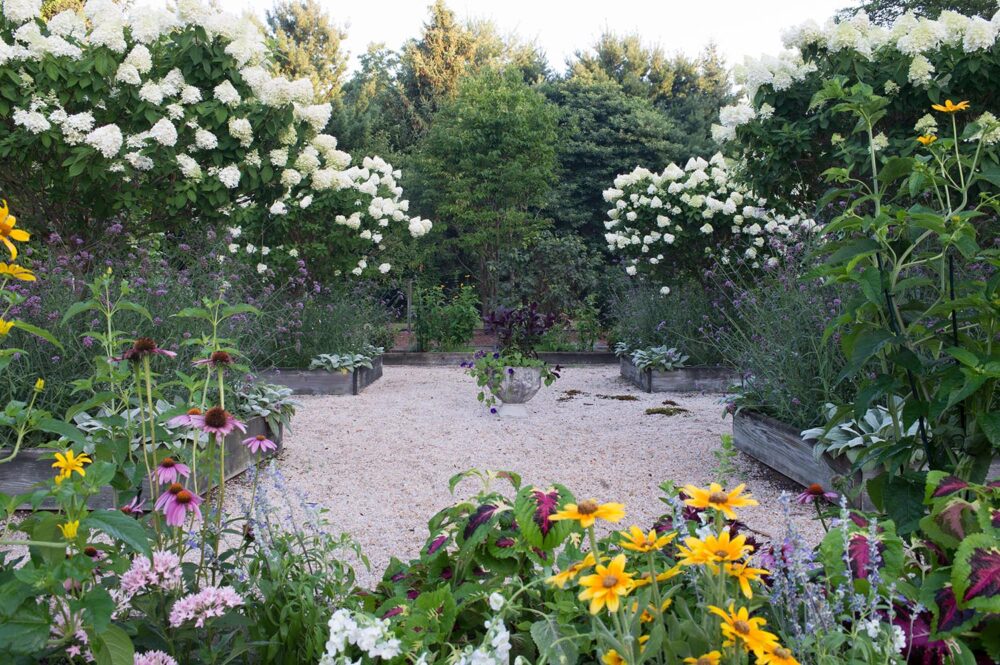
The cutting garden was established by a previous owner. “She planted roses, hydrangeas, peonies, purple irises, daffodils, and azaleas,” Pam says. “I love to create bouquets and place them throughout the house.”
By Cathy Still McGowin | Photography by Michael Blevins