At the start of every year, popular interiors brands announce their “color of the year.” It trumpets the year’s coming trends and helps each brand set a tone for the next 12 months. We love to see what’s trending in interiors, but more importantly, we love considering how these colors call back to their original inspiration—nature! Over the years, FLOWER has collected many colorful botanical arrangements. Let’s see which ones match 2024’s Colors of the Year!
1. PANTONE: PEACH FUZZ
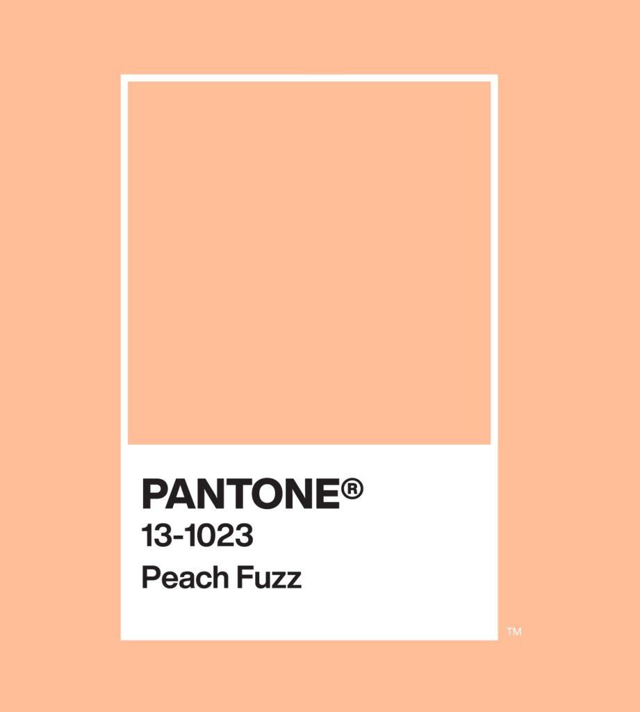
Photo courtesy of PANTONE
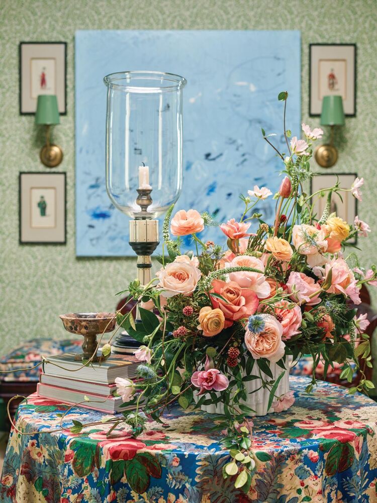
Photo by Emily Followill
This year’s PANTONE 13-1023 Peach Fuzz evokes a sense of comfort. When the world feels chaotic and overloaded, this color brings peace, nostalgia, and cheer to mind. Equally so, this elegant cascade of peach-toned flowers created by Cindy Brock and the team at Miss Milly’s Event Rentals, Florals, & Design for FLOWER‘s Atlanta Showhouse summons feelings of warmth and laid-back whimsy.
See more from PANTONE’s 2024 Color of the Year
See more designs from the Atlanta Showhouse
2. BENJAMIN MOORE: BLUE NOVA
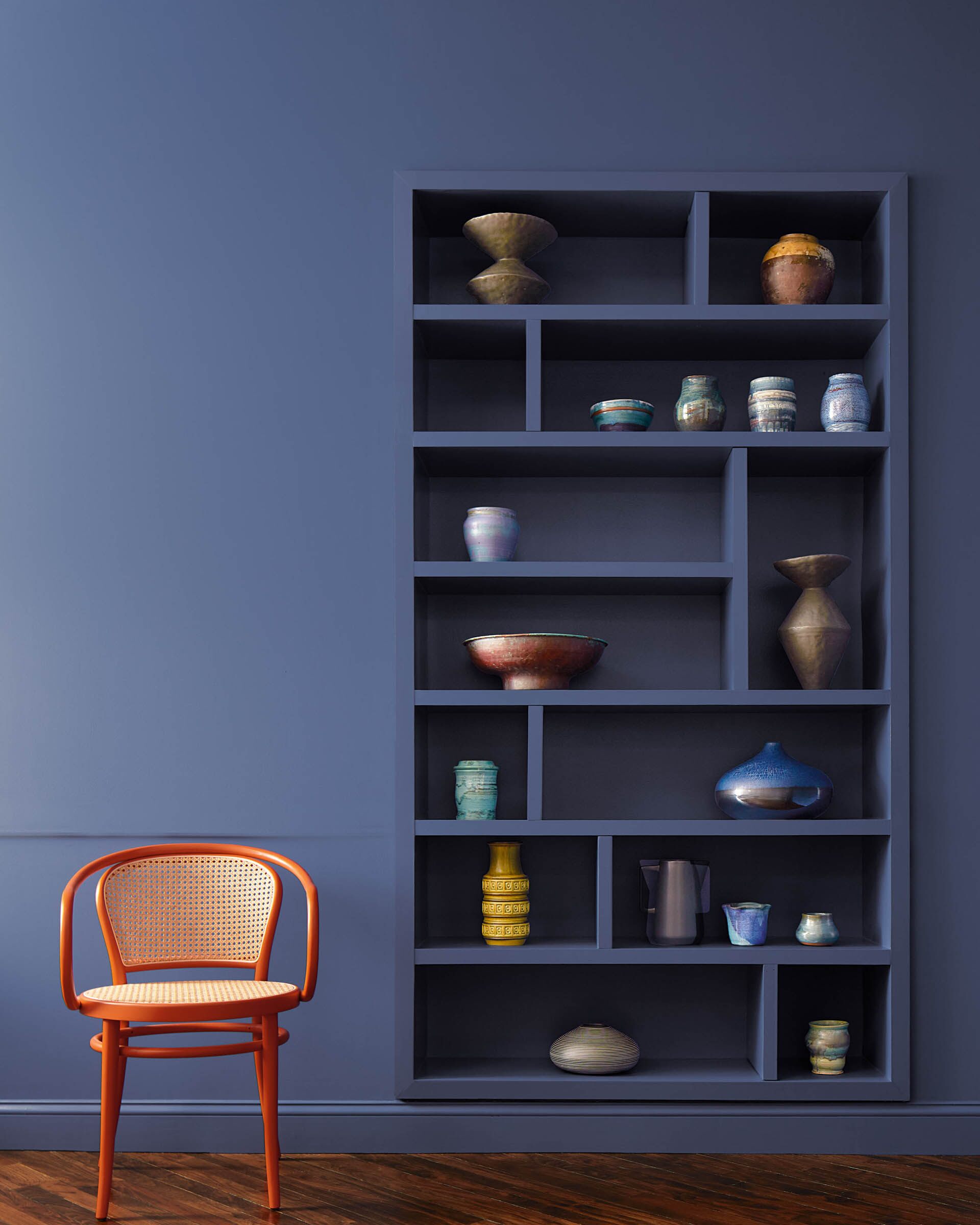
Photo courtesy of Benjamin Moore
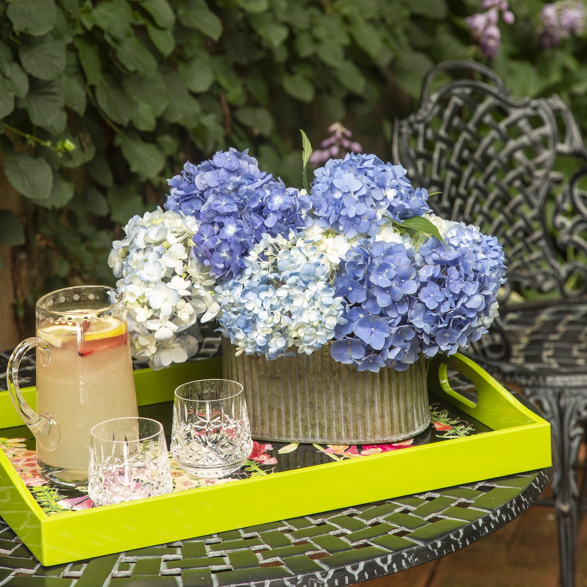
Photo by Erik Kvalsvik & Stacy Zarin Goldberg
Inspired by the majesty of outer space, Benjamin Moore’s Blue Nova (825) calls to mind adventure and exploration while also creating the sense of a calm from a quiet galaxy. A simple bunch of hydrangeas designed by Ursula Gunther of fleursDC best captures this bold blue.
See more from Benjamin Moore
See more from Southern Hospitality on Capitol Hill
3. BEHR: CRACKED PEPPER
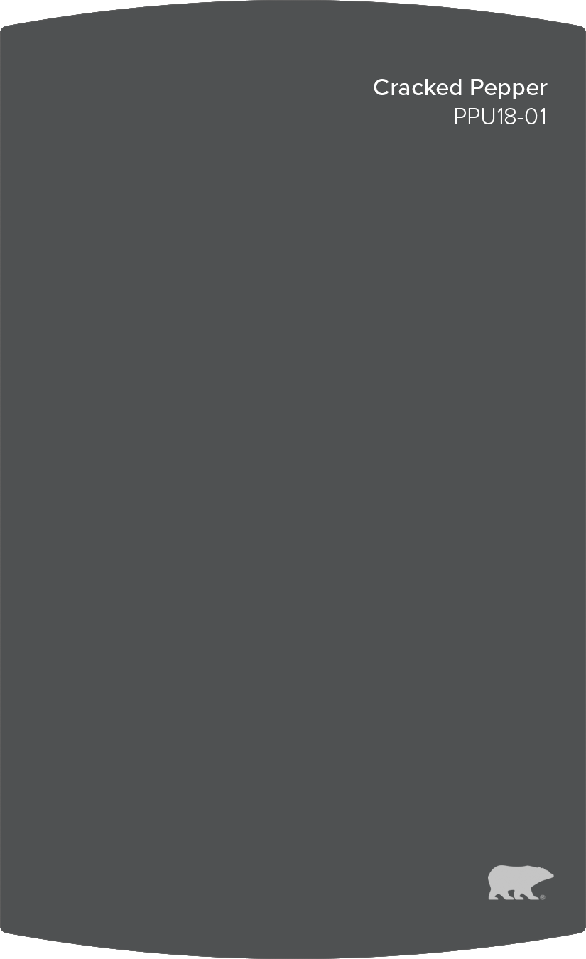
Photo courtesy of Behr
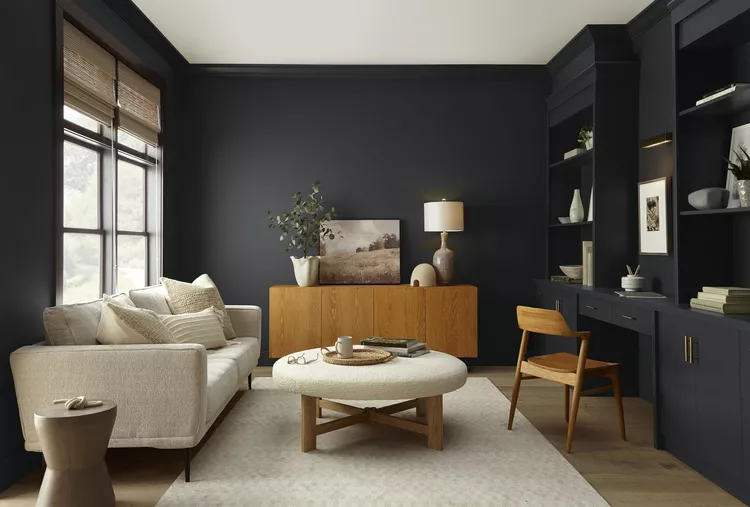
Photo courtesy of Behr
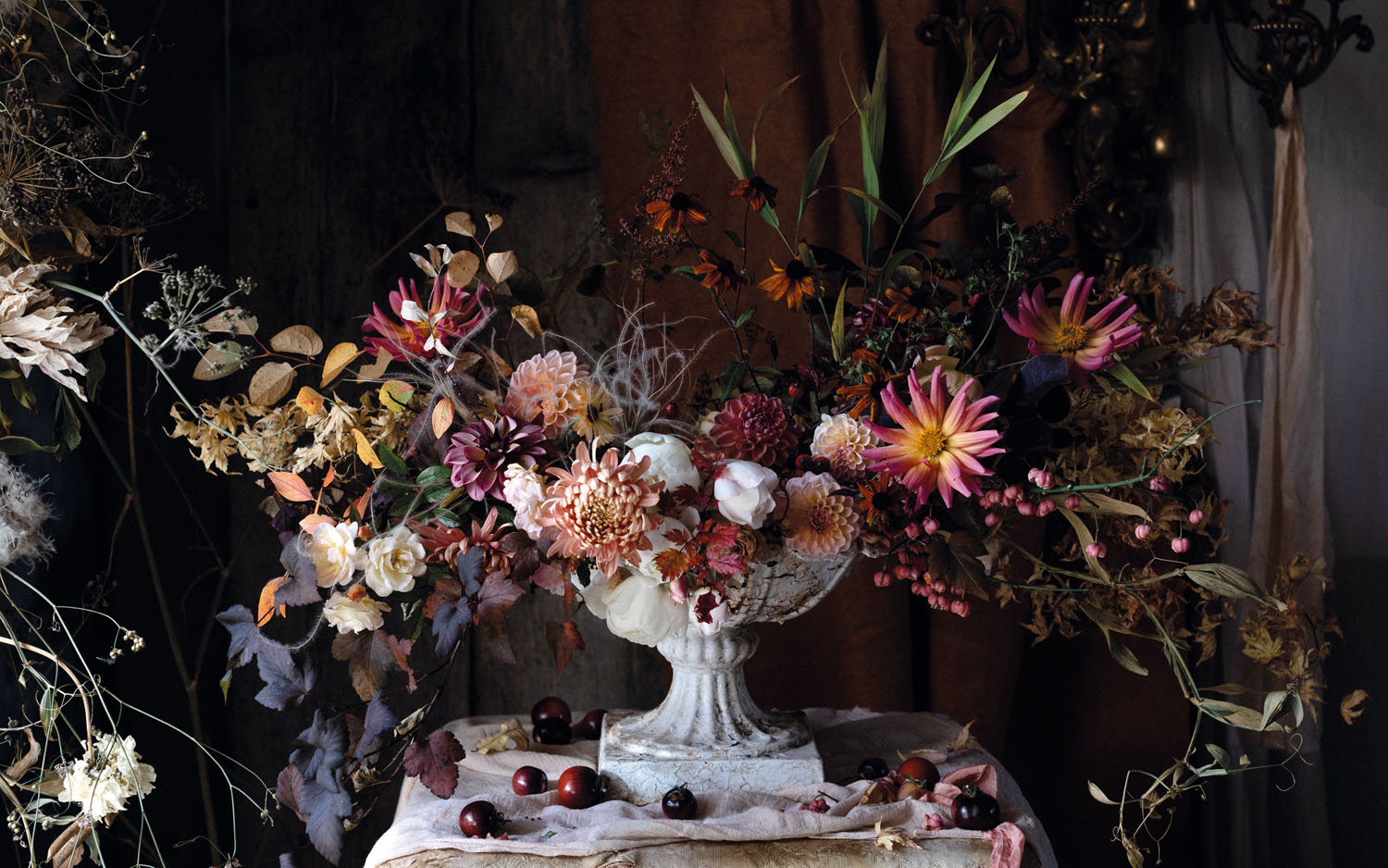
Autumn Urn from The Flower Hunter by Lucy Hunter (Ryland Peters & Small, 2021). Photographs: © Lucy Hunter
Behr brings the first moody tone to this year’s palette with Cracked Pepper PPU18-01. Though dark, the color can serve as a grounded neutral in any room. Lucy Hunter’s dramatic autumnal urn conjures the earthy feel of this soft black.
See more from Behr
See more of Lucy Hunter’s Autumnal Urn
4. SHERWIN-WILLIAMS: UPWARD
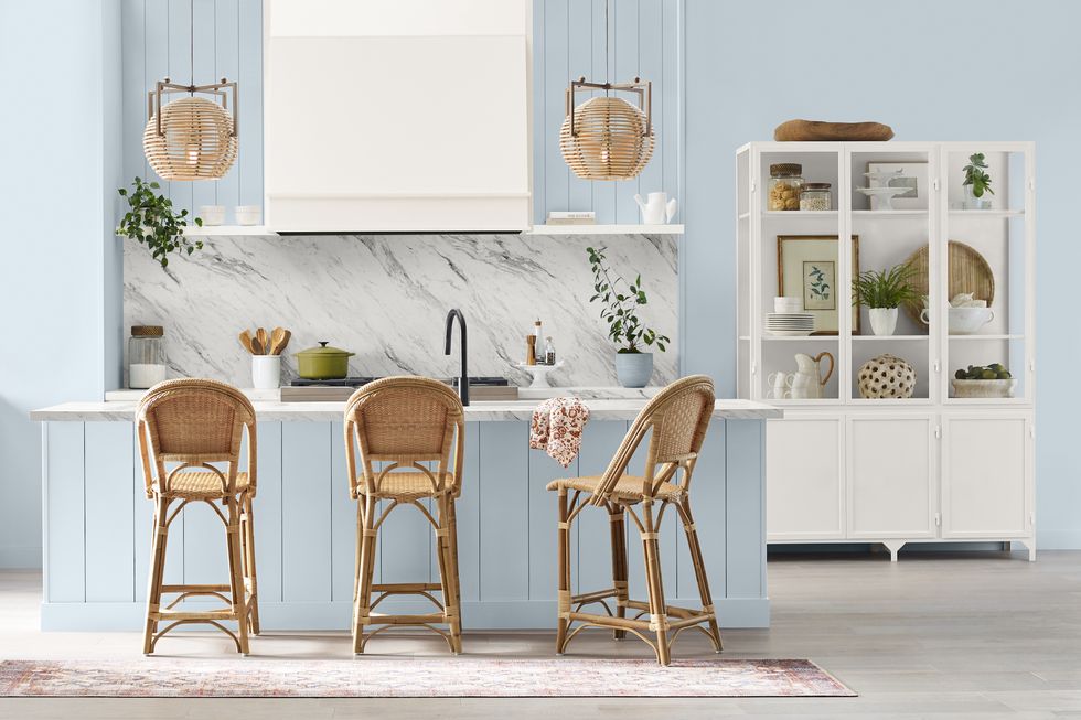
Photo courtesy of Sherwin-Williams
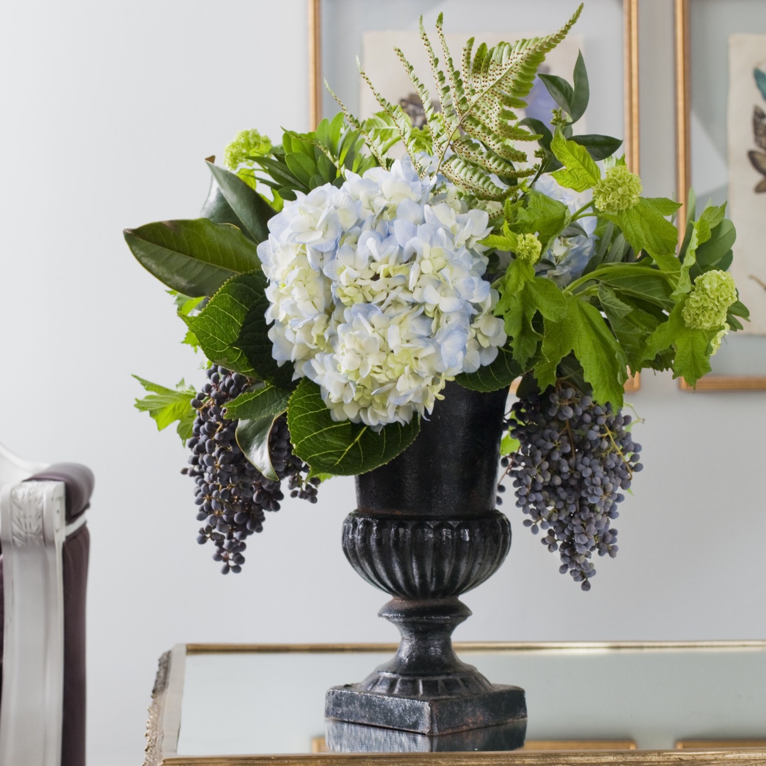
Photo by Taylor Mathis
As the name suggests, Sherwin-Williams 2024 Color of the Year, Upward SW 6239, expresses a blissful, lighthearted energy. It’s an ideal color for brightening up a space and creating a clean, fresh feel. A loose gathering of berries and greenery centered by a barely blue-tipped hydrangeas designed by Jay Lugbihl of In Bloom matches the light and airy feel of Upward SW 6239.
See More from Sherwin-Williams
See More from Jay Lugbihl
5. GLIDDEN: LIMITLESS
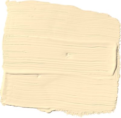
Photo courtesy of Glidden
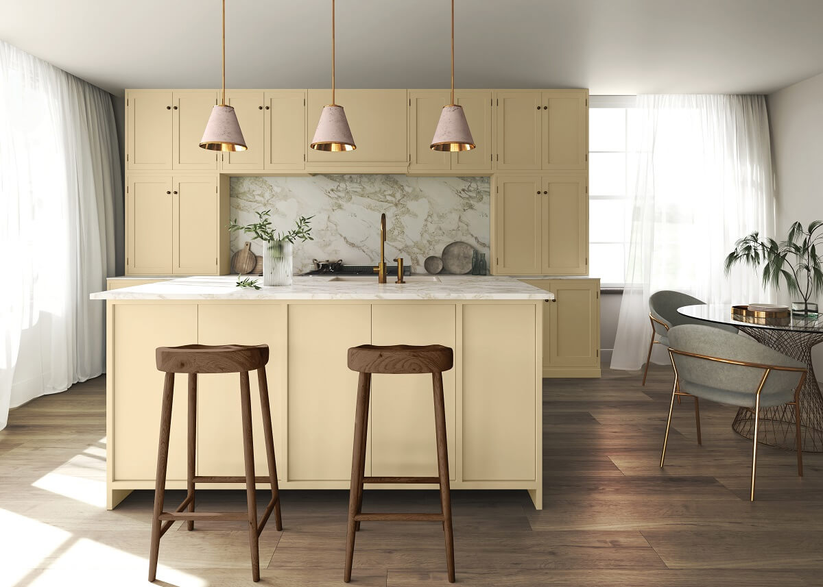
Photo courtesy of Glidden
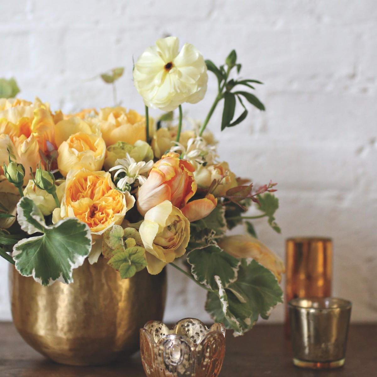
Photo by Alison Conklin
Glidden tapped Limitless PPG1091-3 for its Color of the Year. The color is close enough to beige to act as a neutral but warm enough to stand on its own as a fresh, inviting yellow. This versatile color evokes a sense of liveliness, confidence, and joy. Similarly, this cheery arrangement of yellows and beiges designed by Sullivan Owen could light up even the darkest of corners.
See more from Glidden
See more from Sullivan Owen
6. VALSPAR: RENEW BLUE
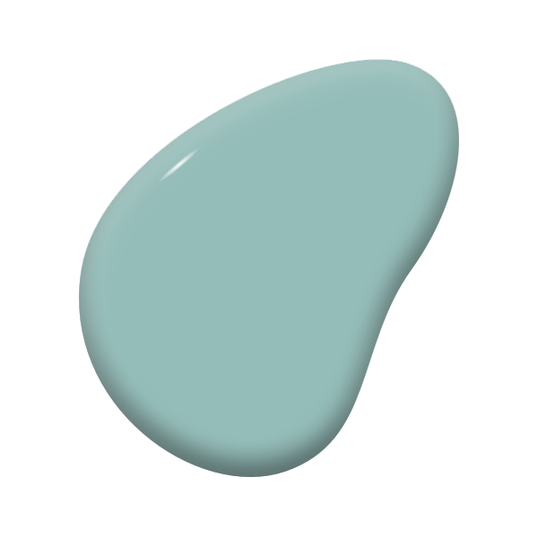
Photo courtesy of Valspar
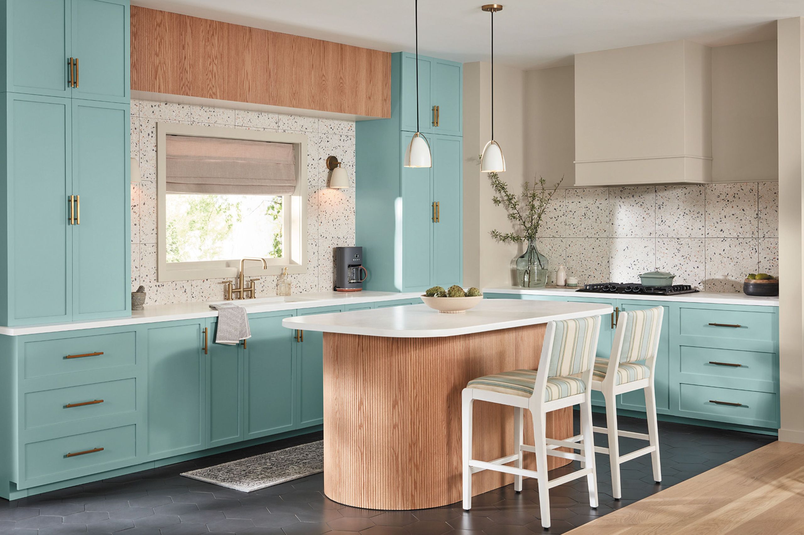
Photo courtesy of Valspar
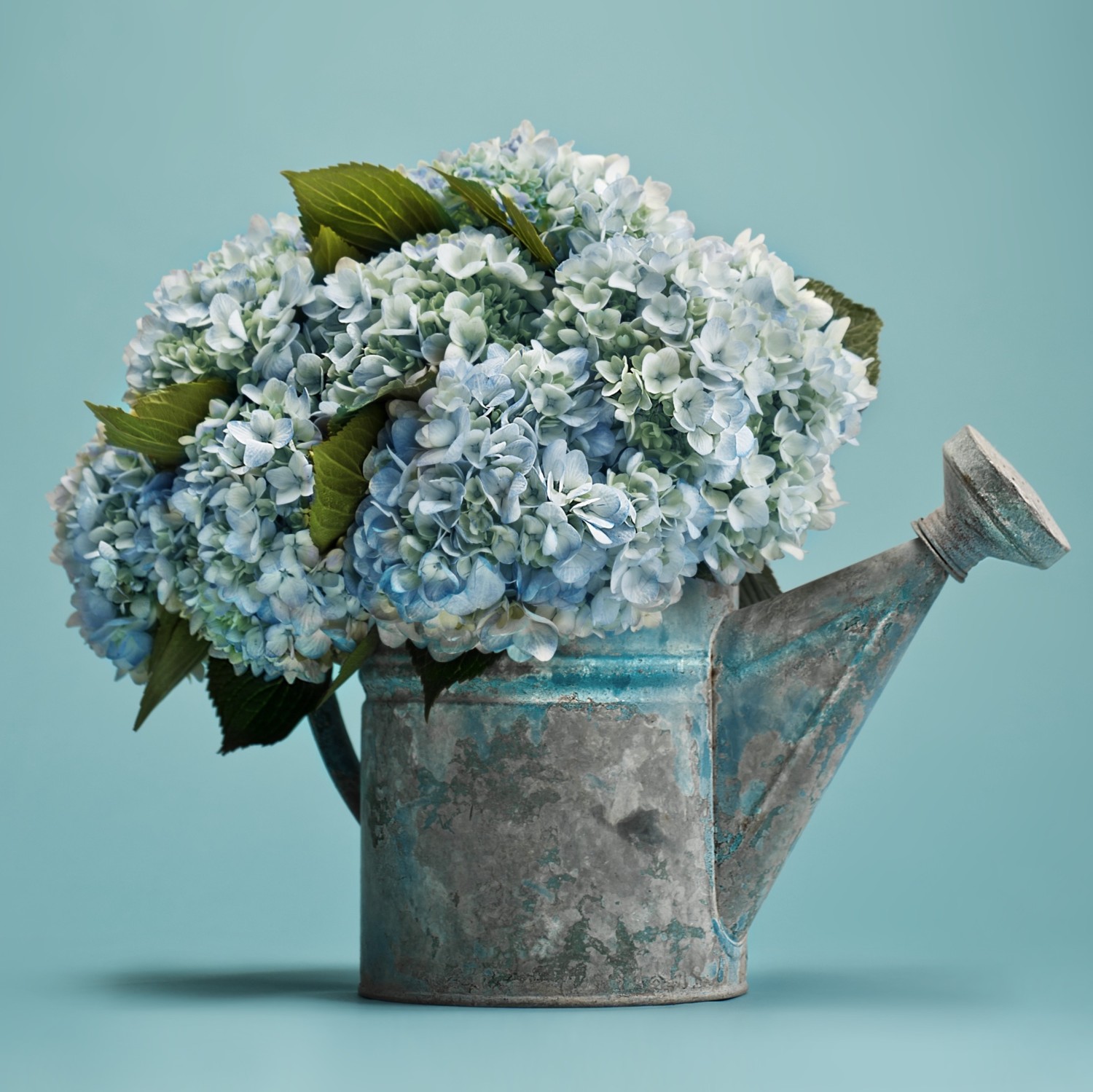
Photo by Liesa Cole
In keeping with its name, Valspar’s Renew Blue 8003-37D energizes a space with the feeling of a fresh start. This color can add pep to any room just as this bold and bright turquoise hydrangea arrangement makes even a simple watering can look chic.
See more from Valspar
See more Hydrangeas
7. HGTV HOME BY SHERWIN-WILLIAMS: PERSIMMON
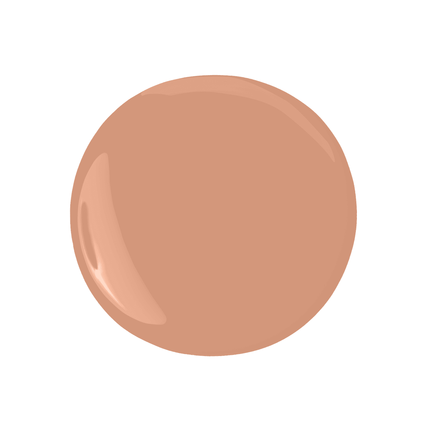
Photo courtesy of HGTV Home by Sherwin-Williams
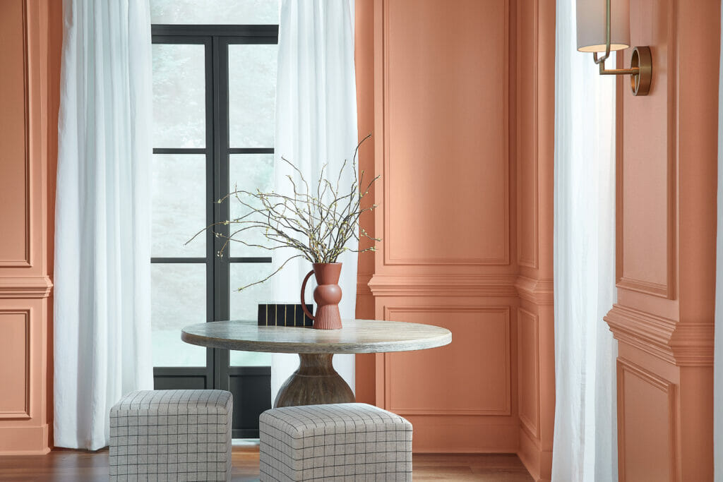
Photo courtesy of HGTV Home by Sherwin-Williams
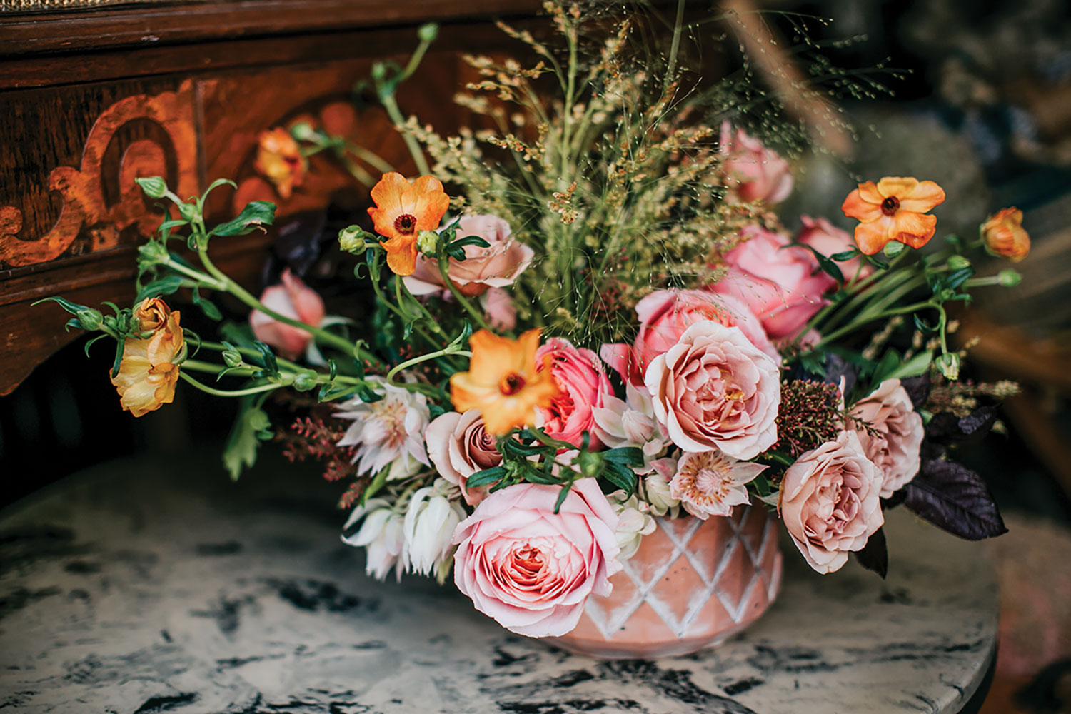
Photo by Jaclyn Simpson
HGTV Home by Sherwin-Williams tapped into an earthy pink for its Color of the Year, Persimmon 6339. The orange-pink complements other warm tones and embodies a quiet femininity. Kelly Marie Thompson of Fleur created a wild and joyful arrangement that also uses warm earthy tones inspired by Midwestern sunsets.
See more from HGTV Home by Sherwin-Williams
See more from Kelly Marie Thompson
8. DUTCH BOY: IRONSIDE
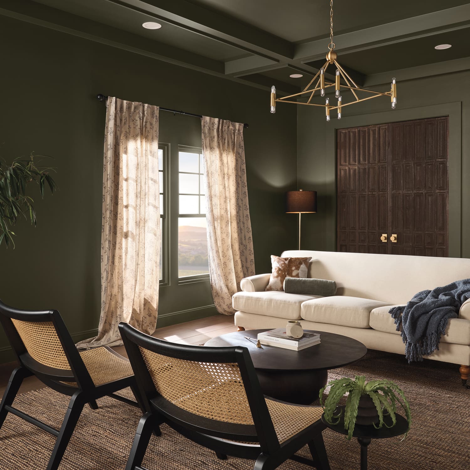
Photo courtesy of Dutch Boy® Paints
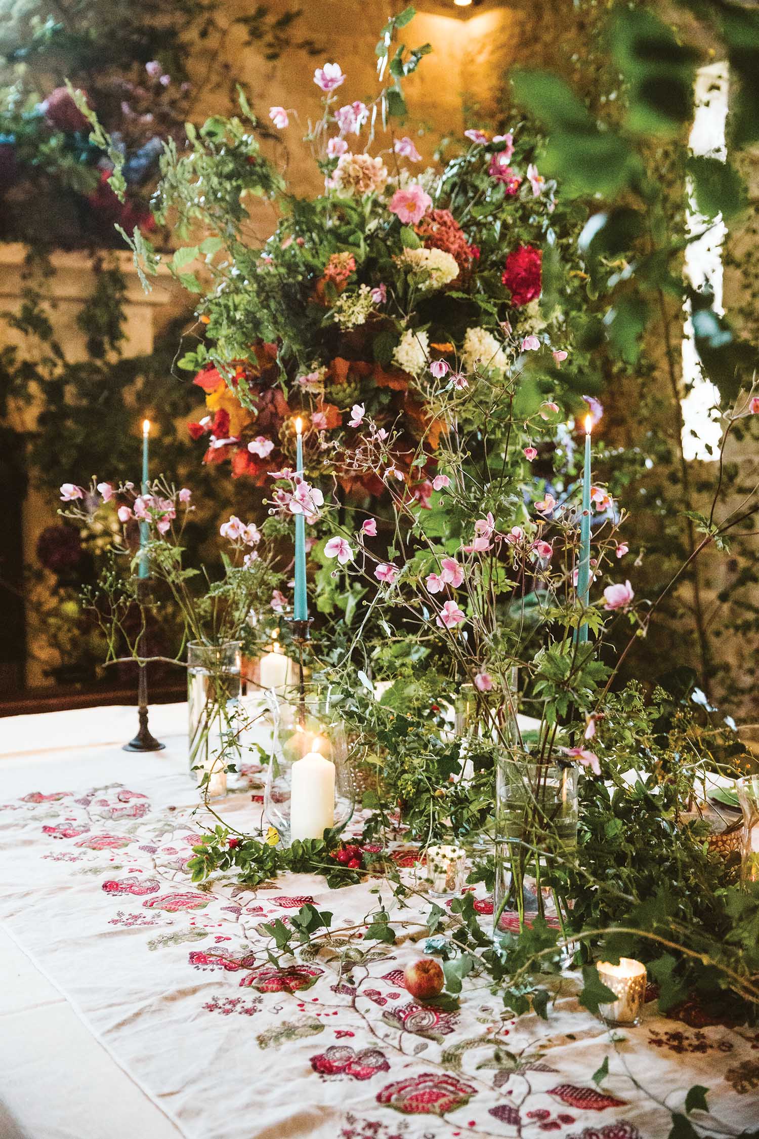
Dutch Boy creates a dignified but cozy green with Ironside 422-7DB. The color calls to mind images of a safe and protected forest where one might like to retreat. Likewise, Tattie Isles of Tattie Rose Studio likes to think of the wild and rambling shapes of nature to inspire her work. In this arrangement, the deep greenery is so lush that it surpasses the flowers for center stage.
See more from Dutch Boy
See more from Tattie Rose Studio
9. YORK WALLCOVERINGS: BAY BROWN
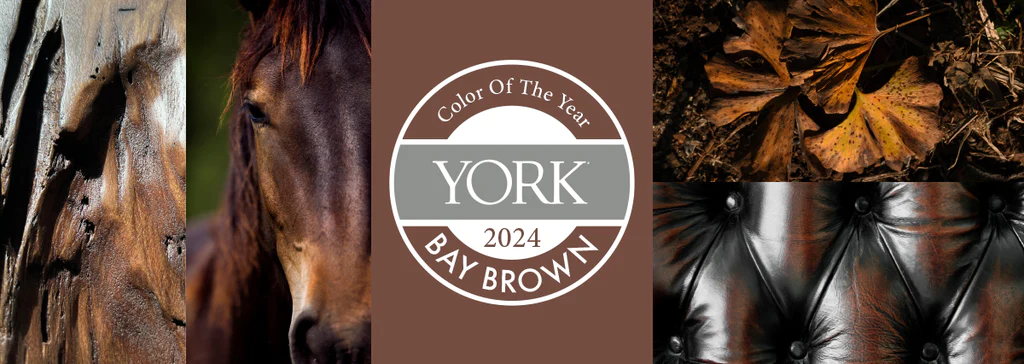
Photo courtesy of York Wallcoverings
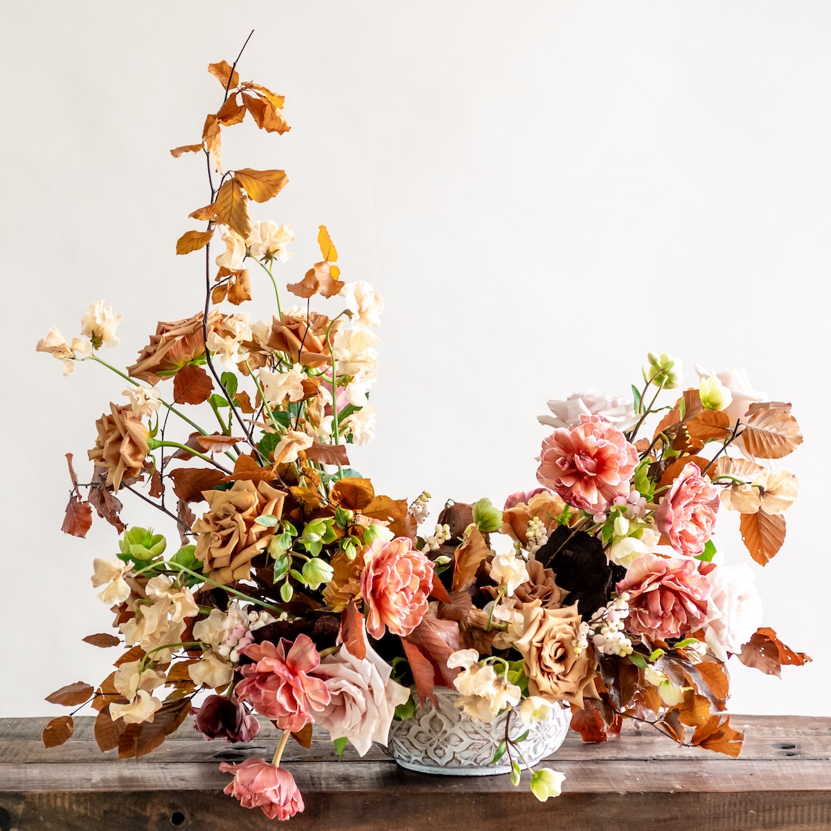
Maria brings unexpected pastels to an autumn arrangement with pink quicksand roses, rosy snowberries, and green hellebores.
York Wallcoverings declared Bay Brown to be the must-have color of the season. Its rich, warm tone and simple elegance reference the quiet luxury trend and can easily work with a variety of other bolder and brighter colors. In her autumnal crescent arrangement, Maria Maxit uses the neutral and grounded colors of a changing season, such as the toffee-colored roses, to exude an understated elegance.
See more from York Wallcoverings
See more from Maria Maxit
By Carrie Clay

