Suddenly, it seems, wallpaper is everywhere. In magazines, movies and Instagram posts, the graphic impact and exuberant effect of wallpaper is irresistibly compelling. It went out of fashion for a while mainly due to its association with fussy rooms of the early 20th century. A younger generation of homeowners preferred minimalist interiors, and found wallpaper too difficult to hang and to remove. But wallpaper is resurging, with global sales of 1.7 billion dollars for 2021.
These days, in the work of high end designers there’s an unquenchable hunger for wallpaper of all sorts, from scenic murals to textured grasscloth. We talk to three interior designers for their considerations when selecting wallpaper and share a glossary of terms to inform your understanding of fine wallpapers.
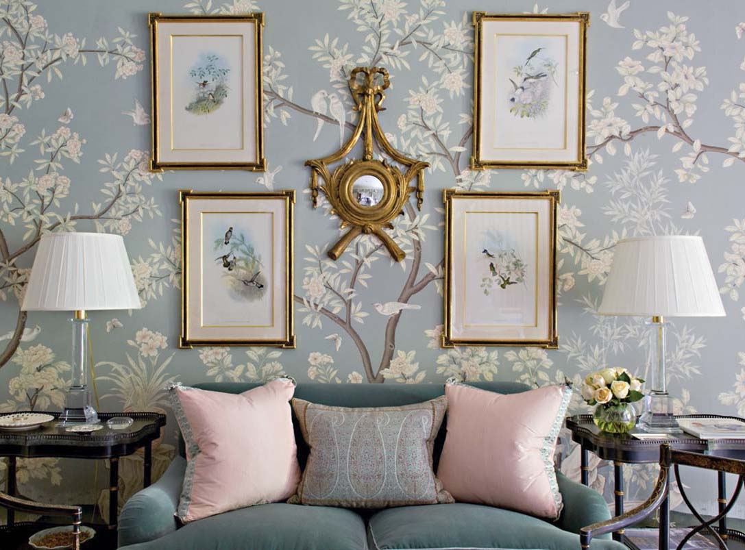
Photo courtesy of Cathy Kincaid
Gracie has been producing hand-painted wallpaper designs, many based on historic scenic patterns, since the 1930s. Here, designer Cathy Kincaid used ‘Hampton Garden’ in a bedroom and sitting area “to create a feeling of a treehouse,” she says.
The earliest wallpapers were small sheets of woodblock prints, made using a piece of wood onto which a design was carved, then inked with a single color and pressed onto paper. Zuber et Cie began making woodblock wallpaper in 1797 and still uses their original blocks in current designs. Early wallpapers were mainly used by merchants to line display cabinets.
From the mid-18th century and into the 19th, trade between China and Western countries fueled a passion for Chinese wallpapers, as a badge of sophistication. Western manufacturers quickly started making their own Chinoiserie wallpapers, and some of today’s most sought after handprinted wallpapers come from firms established during this boom, like de Gournay and Gracie.
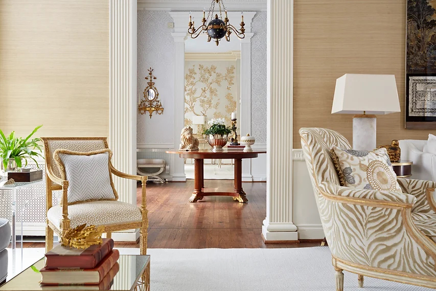
Photo by Kip Dawkins
A glimpse into three spaces designed by Kelley Proxmire reveals three wallpaper treatments. Phillip Jeffries' Amalfi Silk 'Sands of Lazarro' in the living room, 'Mina' from Soleil Bleu in the foyer, and Gracie panels of hand-painted 'Sepia Garden' in the dining room beyond.
These days, designers have a plethora of choices in lieu of paint. Kelley Proxmire, a designer in Bethesda, Maryland, uses wallpaper in every project. “If the client doesn’t have much artwork, wallpaper can bring interest to the walls,” she says. “I use it on more places than just walls. I love to paper a ceiling. It’s great in a bedroom because when you’re lying in bed, you look up.” It’s especially nice when you pair it with a complimentary pattern on the walls, like a stripe with a floral or a trellis paper on the ceiling.
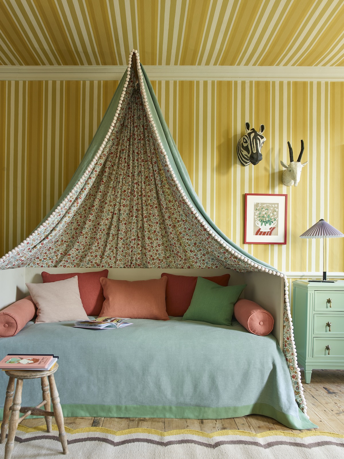
Photo courtesy of Liberty Fabrics
In a child's bedroom, an Obi Stripe paper in vibrant Fennel from the Botanical Atlas collection by Liberty Fabrics is used on the walls and ceiling.
Proxmire also recommends including trim in your wallpaper scheme. “Choose a color from the wallpaper to paint the crown molding and baseboards,” she advises. Powder rooms are a favorite site for this type of treatment, where a jewel box effect can be achieved with intense color and pattern.
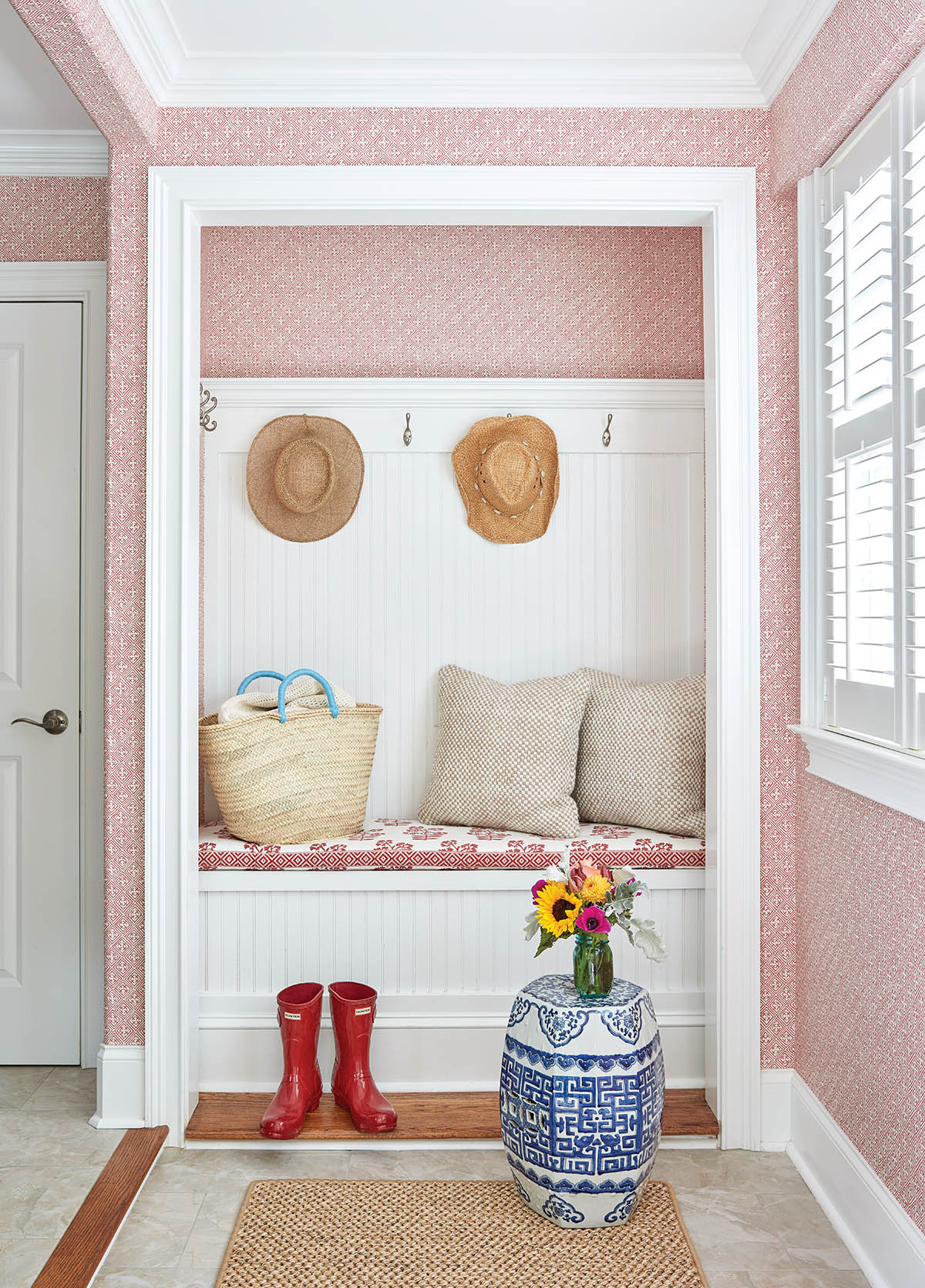
Photo by Brian Beider
In this mudroom, Maggie Griffin hung a Thibaut wallpaper in a geometric print to bring interest to an otherwise utilitarian space.
Maggie Griffin loves to use wallpapers in utilitarian spaces like laundry rooms, as a surprising note of polish. But she also deploys them in bathrooms. “Wallpaper in rooms with very little fabric, like bathrooms, can add personality to a space, especially if you pull a bold color from the wallpaper for the cabinetry,” says the Gainesville, Georgia designer. “Using in wallpaper in a foyer sets the tone for the house, and provides a fun punch of color as guests arrive.”
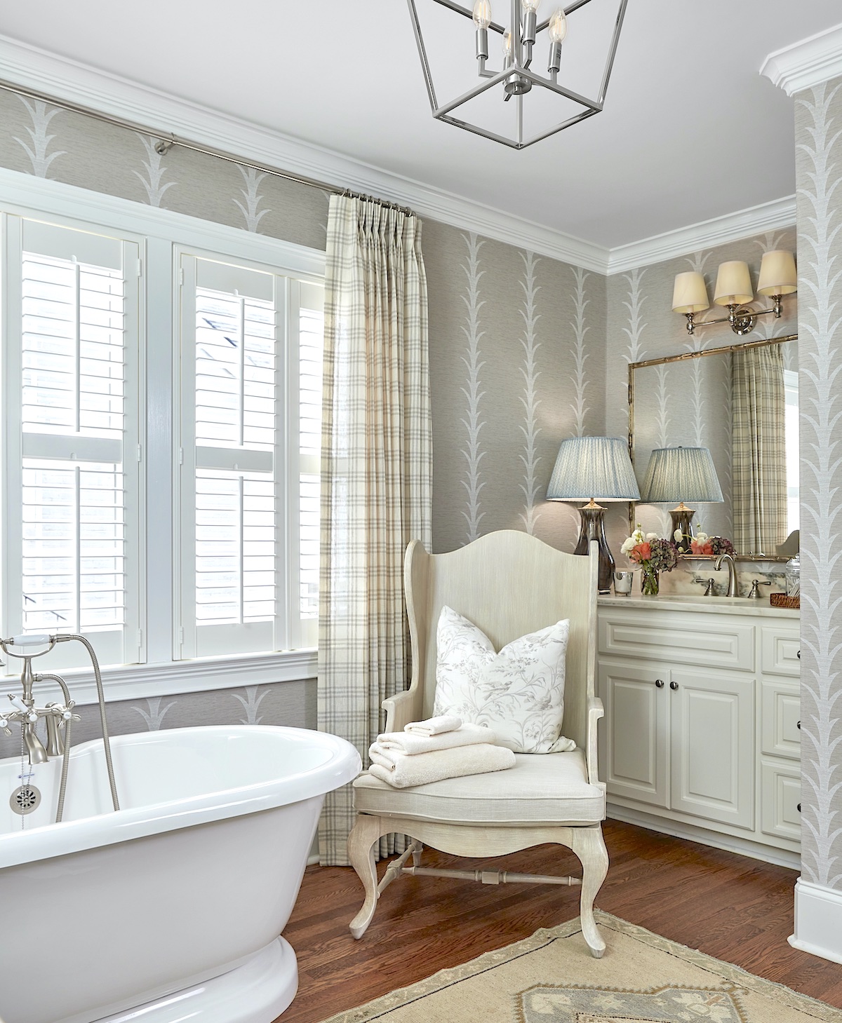
Photo by Brian Bieder
Maggie Griffin papered this bathroom with Schumacher's Acanthus Stripe Vinyl in Taupe.
Innovations in vinyl wallpapers allow their use in damp spaces that would have been discouraged in the past. Griffin recently papered a bathroom in a rich vinyl grasscloth, adding texture and warmth to the room. “It’s a really large room,” she says, “and the handprinted stripe adds a sophisticated touch.”
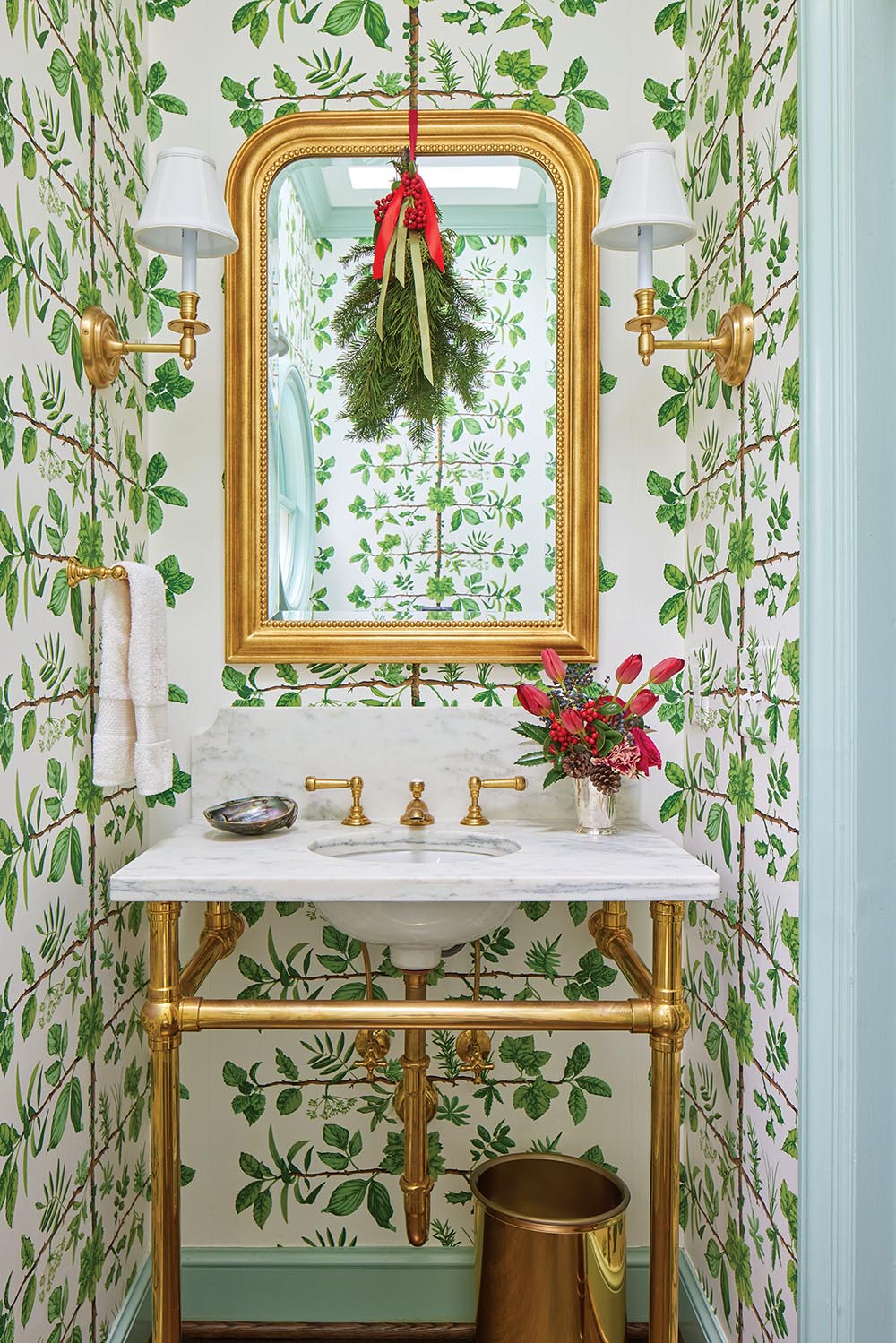
Photo by Hector Sanchez
For this powder room, Zoë Gowen used a bold, graphic L’Espalier wallpaper from Pierre Frey.
Birmingham, Alabama designer Zöe Gowen takes a maximalist approach to wallpaper. “If you’re going to all the trouble of measuring, ordering, and installing, I think you need to go all in for wallpaper that’s really transformative,” she says. “One of my favorite applications is to take a kooky shaped room with odd soffits and gables cutting into the ceiling and cover it with a snug pattern like Fuschia by Twigs Wallpaper or Elderberry by Mazy Path . The more that the wallpaper’s pattern appears to climb the walls, the better. I promise it will become everyone’s favorite hideout in the house.”
The power of wallpaper to elevate and animate a room is so complete, it’s practically magic.
A LUXURY WALLPAPER GLOSSARY
Understanding the language of fine wallpapers will help you choose the right wall covering for your space.
Block Prints: Made from machine or hand-blocked prints from woodblocks, block prints have a crafted quality that makes them easy to customize.
Faux Finishes: Usually rendered by expert painters, faux finishes for walls are as easy as hanging wallpaper. Tortoise shell, crocodile skin, or suede for your room? Yes, please.
Flocked Wallpaper: Originally created to imitate the look of costly cut velvet wall hangings, flocked paper was made by sprinkling a dust left over from cloth manufacturing onto a pattern of glue. It dates back to 1680, but by the 20th century it had fallen out of favor. And some historians believe that it was flocked paper that gave wallpaper in general a bad reputation.
Grasscloth: Originally woven of raffia, grasscloth has a wonderful sheen and hand-crafted quality. It now comes in a kaleidoscope of colors to suit bold color schemes. Vinyl grasscloth is a convincing substitute for the natural version and possesses the added benefit of being compatible for use in bathrooms and other damp rooms.
Grisaille: Creating a dreamlike background, classic grisaille is a study in gray, with a scene rendered only in degrees of gray. Now is has branched out to include other hues, but the primary color is gray. A grisaille wallpaper could be a tartan, a Greek ruin scene, or a floral pattern all rendered in shades of gray.
Hand-Painted Paper: Labor-intensive and priced accordingly, hand-painted wallpapers are endlessly customizable for colors and to feature favorite flowers, birds, even people. They can be painted on fabric or paper for gorgeous finishes.
Landscapes and Murals: The appetite for extra large designs has led to a growth in scenic wallpapers, from a cloistered garden to a cityscape. What better way to honor a favorite place than with a wallpaper depicting its flora and fauna?
Liner Paper: If the surface or a wall is irregular or damaged, a liner paper might be used to smooth it out before wallpaper application.
Prints: Modern technology can create beautiful wallpapers, from mass market products to digital printing, and the revival of screen-printing. Many companies are experimenting with classical prints in shocking, modern colors. We live in an era of playful design, and wallpaper designers are making the most of it.
Repeat: A repeat refers to the width of the pattern, and it is crucial in choosing a wallpaper. The larger the repeat, the more difficult it is to hang; conversely, the smaller the repeat, the easier. If you love the look of an oversized print, and who doesn’t, hire the best wallpaper professional you can afford to install it.
Vinyl: Wallpapers made from vinyl are easy to clean and available in a wide range of price points.
MORE DESIGNERS ON WALLPAPER
Six more interior design pros share their thoughts and tips on wallpaper.
“I love wallpaper. I love it in rooms and even in closets. In my view, it just adds another layer of richness. I mean, I do love paint, but wallpaper is better.” — Charlotte Moss
“I might use wallpaper to create architecture with a trellis and floral motif, elongate the visual aesthetic with a climbing vine, or give me an all-over-but-the-shouting background on which to build layers.” — James T. Farmer
“I love bright, almost-geometric modern florals for children’s spaces and kitchens; darker and more classically inspired motifs for gentlemen’s rooms; and eye-catching, big patterns for contemporary spaces.” — Elaine Griffin
‘We use all wallpaper regularly! It’s one of our favorite ways to add drama, color, and scale to a room.” — Courtney Coleman & Bill Brockschmidt of Brockschmidt & Coleman
“Gloria Vanderbilt’s romantic bedroom with a classic Rose Cumming wallpaper is as fresh and beautiful today as it was in the early ’80s.” — Matthew Patrick Smyth
“Dining rooms can have more pizzazz than other spaces because you’re in them for short bursts of time, so they don’t become overwhelming. Also, scenic wallpaper works best when it’s relatively unobstructed. Therefore, it’s good for a dining room where the table floats in the middle of the room.” — Bunny Williams
By Lydia Somerville

