When the game table isn't being used for a high-spirited round of cards, it often becomes a gathering spot for informal meals. French doors provide access to a Juliet balcony with views of the well-heeled neighborhood.
As founder and principal of Liz Caan and Co. in Newton, Massachusetts, near Boston, designer Liz Caan is well versed in working with historic homes. So when one of her online followers reached out to her regarding a game room renovation in a classical brownstone in Boston’s South End, Liz was fully onboard. And as things progressed, this timely alliance of designer and project could not have been more appropriate.
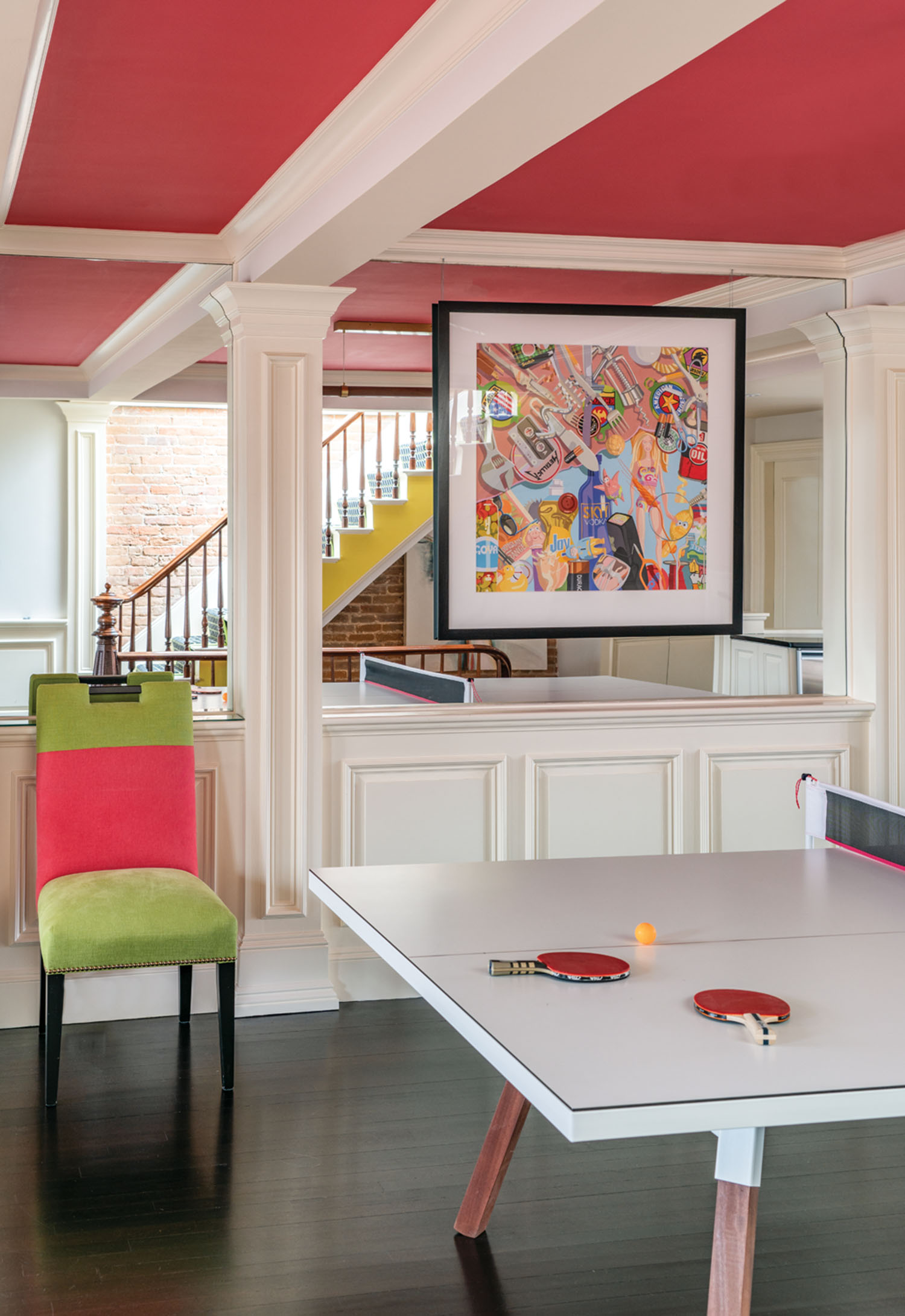
To accomplish her goal of injecting a "serious dose of happy" into the fourth-floor rec room, designer Liz Caan painted the ceiling above the Ping-Pong table hot pink. Whitewashed box beams crisscross the expanse, adding a traditional touch to an otherwise retailored space.

Throughout the home, Liz used imaginative light fixtures, such as the "Zettel's 6" chandelier by Ingo Maurer from Casa Design Boston.
Along with design cohort Cooper Herrlinger, Liz went into warp speed while the owners’ college-aged children were off at school. “In the process, what initially started out as a small project quickly grew into a total refreshening and partial renovation of the remaining spaces,” she says. That meant the design team faced the sizable task of maintaining the townhome’s imposing presence while updating it for modern living.
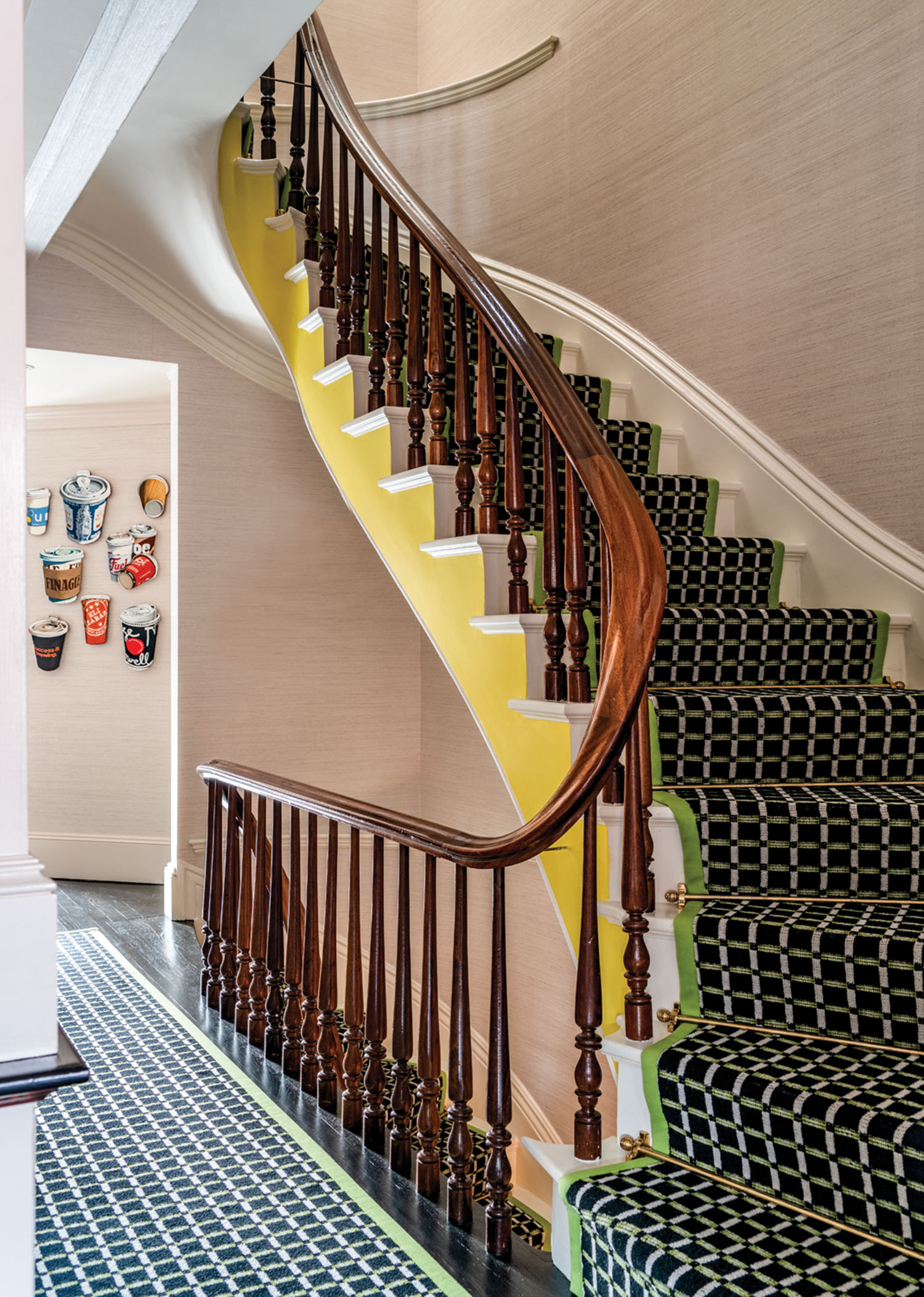
To the delight of everyone involved, the original staircase and balusters needed only a coat of paint.
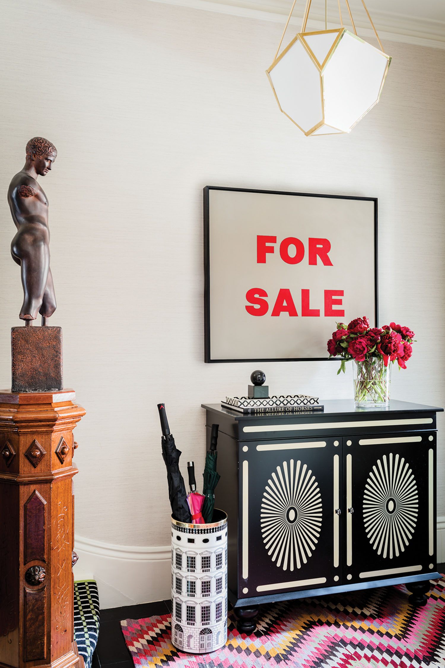
The owners' avant-garde furnishings, such as the foyer's sculptural newel post, provide a welcome contrast to the brownstone's traditional details.
From the outset, Liz and Cooper realized that the homeowners and the existing residence were a mismatch. “The clients are a vibrant, upbeat couple who enjoy art and entertaining, but their house displayed none of these qualities,” Liz says. “Instead, it was dark, overly masculine, and dated.” Early on, she enlisted one of her favorite contractors, Sasha Durand, to remodel the bathrooms and kitchen. Then Liz and her team began assembling plans for decorating and furnishing the entire home to make it more in line with this fun-loving family. “While we did re-cover some of the owners’ existing items, for the most part we designed custom pieces specifically for each room,” Liz says. The team consulted with local furniture and upholstery companies to achieve the right comfort level and scale for the new elements.
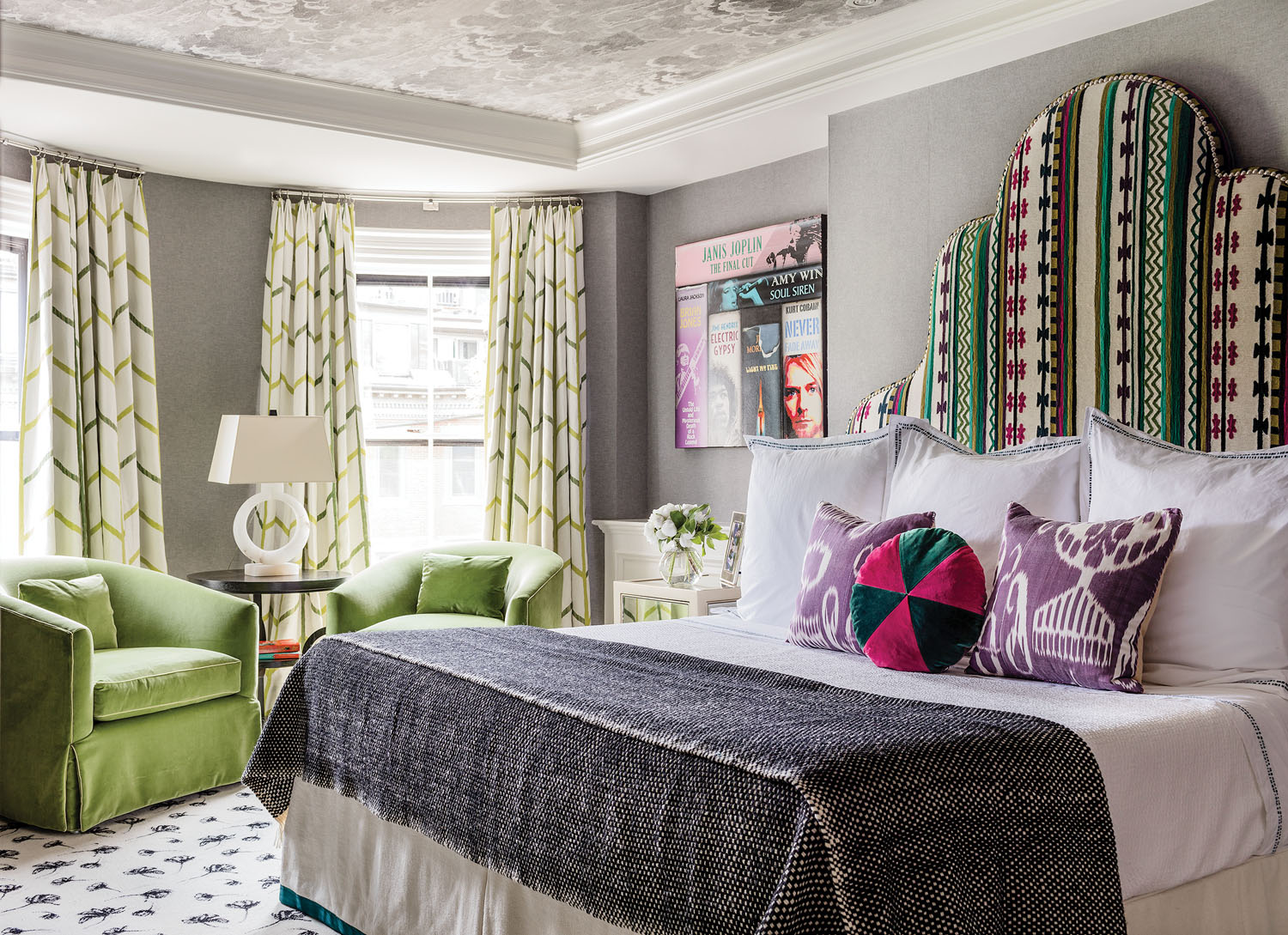
In the third-floor master suite, Liz and her design team let color take control. Starting with a black-and-white carpet base on the floor ("Shadow Flower" from Stark Carpet), they installed a colorful headboard and then pulled out purple and green hues with chairs and pillows.
A major factor in choosing items for the home was the owners’ impressive range of artwork. The pieces ultimately served as striking backdrops in almost every room. In fact, Liz leaned heavily on those works when choosing her palette of paint and fabric colors. “We found the wonderful array of paintings and objects to be very inspirational—even to the point of giving us license to go a little wild,” she says. “Still, we were careful not to compete with the visual impact already established by the homeowners’ collection.”
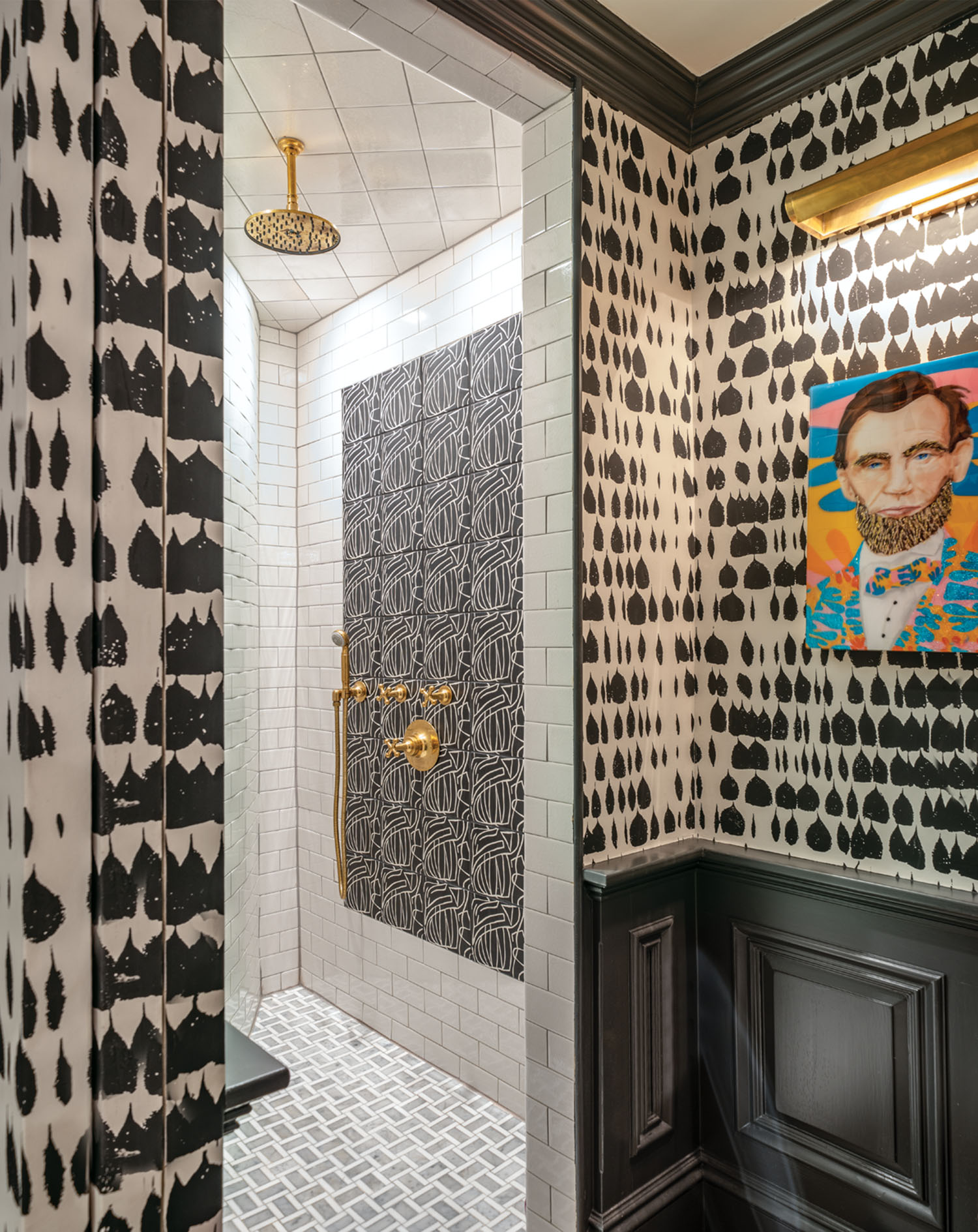
For the daughter's bathroom, the designers used an accent tile to highlight the gold fixtures. "We had to replace the plumbing components, which destroyed the existing wall, so we decided to create 'tile artwork' in the shower," Liz says.

The daughter's first-floor bedroom was inspired by her love of pink-and-red color combinations. "We were spurred on by her youthful spirit, so we really went to town in this room," Liz says. The bold fabric on the windows (Pierre Frey "Heather" in Tutti Frutti) ties everything together.
For the new lighting fixtures that punctuate each space, Liz and Cooper took an approach that at first might seem odd for a 160-year-old townhouse but in retrospect works perfectly. “We intentionally searched for more contemporary lighting to help balance the home’s mix of old and new,” says Liz. Such an unexpected design decision gave the period residence a renewed charm that only strengthens its traditional elements.
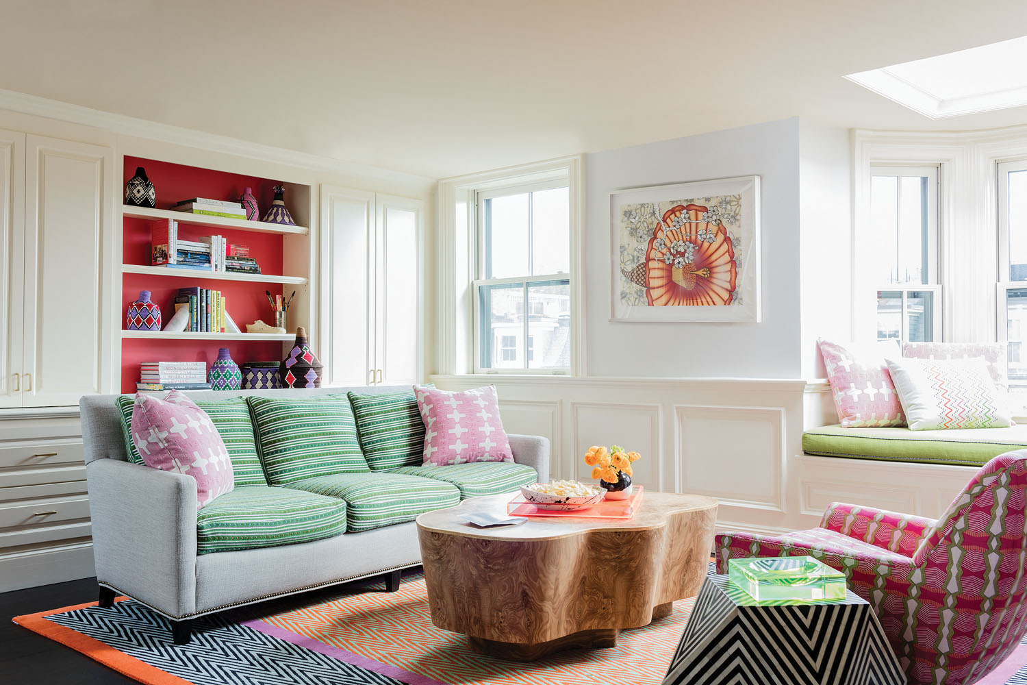
The vibrant orange, pink, and purple colors in the "Herringbone" rug (from The Rug Company) pair with lime-green accents to make the family room a lively, go-to place in the transformed townhouse.
Once assembled and arranged, the furnishings, art, and accessories, coupled with personalized touches that Liz and her team oversaw, appear well culled—and that was Liz’s overall goal. “We wanted this brownstone to match the energetic personalities of those who live here,” she says. “The result is a highly custom-tailored home that’s wonderfully reflective of its engaging occupants.”

Liz points to the refurbished library to best explain her design approach. "We set about infusing color as a primary way to balance out the brownstone's more historical elements, such as the Victorian mantels and fireplaces," she says. Vibrant fabric selections and well-chosen accessories also keep the period embellishments from coming across as too dated.
COVERING THE SPECTRUM
The real showstopper in this brownstone’s transformation is Liz’s masterful use of color and texture to enliven the spaces and form a balance among such wide-ranging styles. For the designer, it’s all about envisioning a certain mood that’s often specific to a room. “We were always conscious of weaving color throughout this residence,” she says. “Starting in the top floor game room and family rec area, we picked these spaces to be the brightest. From there, we diluted and muted the tones a bit as we moved down the staircase to the first floor.”
In the more public spaces, such as the living room, Liz’s team chose a lighter, somewhat less intense range to convey a steadied degree of sophistication. “This color change also gives the homeowners a chance to ‘rest their eyes’ a tad in comparison to the bolder patterns and pigments found elsewhere,” says Liz. And in the more private spaces such as the master suite, the designer relied on moodier, deeper hues that seem to encourage lingering and relaxation.
By Robert C. Martin | Photography by Michael Lee and Eric Roth

