Collections of Chinese Rose Medallion porcelain decorate the living room of a Virginia country home. Photo by Mali Azima
Flower: The title of your book, House Dressing (Monacelli Press, 2021), is so descriptive of your work—creating rooms that look good with the house, the inhabitants, and the elements inside. What inspired that title, and how does it reflect your work?
Janie Molster: I wanted to simplify the whole idea of interior design. We all know the clothes we like, the colors that look good on us, even the jewelry that works with our personal style. But people lock up when they think about what to do in their own house. Really, the idea is the same: Dress your house with things that are flattering and have meaning. If you have a knee-jerk reaction to something, listen to it.

Janie Molster. Portrait by Tasha Tolliver

Framed antique maps line up beside the mantel. Photo by Mali Azima
In the book you talk about loving modern design, but you live in Richmond, with its wealth of historic architectural styles—Federal and Greek Revival, Italianate, Neoclassical and Beaux Arts, even Art Deco. How have you reconciled your personal taste with living in a city known for its traditional architecture?
I have worked on many older homes because of where we are—remodels and updates that make an old house feel fresh without taking away from its character. That’s comfortable for us. It’s what we cut our teeth on really. But then we get an uber modern rooftop condominium, and it’s so much fun—a fabulous dramatic contrast. We pull from the best of what surrounds us to create beautiful, livable spaces. We’re lucky in Richmond to be surrounded by great artists, important museums, and galleries. Virginia Commonwealth University is at our back door, and they have an amazing art program.

Savonarola campaign chairs with their original upholstery pull up to an oval farm table. Photo by Mali Azima

Gardenia branches atop an antique marquetry chest strike a compelling contrast against the mossy green walls. Photo by Gordon Gregory
Twenty years ago, Colonial Williamsburg shared their discovery that pale historic colors associated with historic architecture were inaccurate. Interior colors were in fact vibrant rather than soft and faded, which goes along with your approach to historic properties.
Yes! Not long ago, I was able to spend some time with the researchers at Williamsburg and hear the story about their discovery of the original bright colors at the properties. I was even on a speaker’s panel with Margaret Pritchard [senior curator at Colonial Williamsburg], and she told the story about the discovery from peeling back years of paper and paint. I wanted to yell, “See, I told you so!”
That said, we never want to overwhelm architecture. Sometimes when you are working in a house with great bones, you have to sit back and let the house tell the story.

A collection of pressed botanicals lines the stairway in a Greek Revival house. Photo by Kip Dawkins
You have a sure hand with color, and the flower arrangements in the book bear that out—rich, saturated colors that reflect the shades at play in each room. How do you approach flowers in your designs?
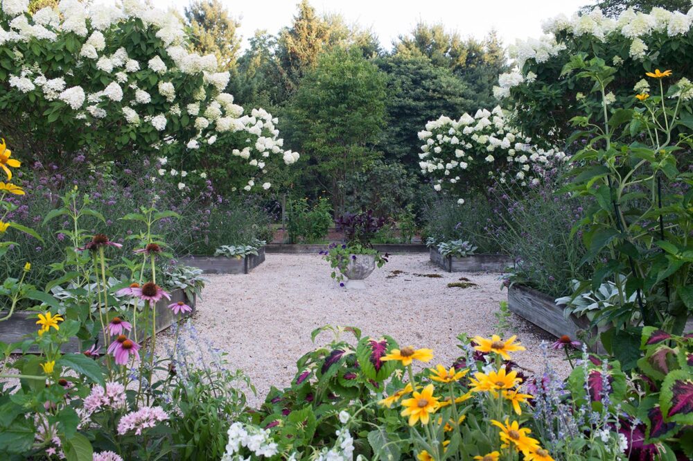
When we put flowers together, I want it to look as though someone rushed in the door from a busy day at work with a handful of flowers that they picked up at the corner market and then plopped in a vase. But that kind of studied naturalism never works. You have to play to get it right. I love it when there’s a bounty of stuff in my garden or a friend’s. I’m all about volume and scale, and I make sure to have containers, long stems from the garden, or a single, sculptural tree branch. My favorite flowers are camellias, even though they’re fragile; gardenias, another finicky flower; viburnum because it’s durable and tough; and, like most designers, I love peonies.

A cluster of paintings from destinations across the globe gives this bedroom a cosmopolitan vibe. Photo by Luke White
We can’t talk about your work without touching on pink. Of course, there are other minimal spaces and different shades, but please share the origins of your passion for pink?
I dig into this in the book. I think we’re born with a color palette. And we tend to stick with it to varying degrees as we age. My palette goes from the palest of pinks to fuchsia and watermelon reds. It pops up in my wardrobe. Whenever I’m asked to bring something to a party, a signature pink cocktail is a go-to. Everyone looks good in pink. Everyone looks good in pink rooms. People don’t get tired of a color, just of how it’s being used.
You’ve raised five children, so that makes you an expert on negotiating the real battle of muddy shoes, sticky fingers, and errant soccer balls versus fragile antiques, fine art, and silk fabrics. How has that influenced your design decisions and living-well approach?
Frankly, it’s gotten easier with every passing year, thanks to the evolution of performance fabrics. We now see outdoor velvets and damasks, trims and tassels that look great inside and out. We all want our house to look as fresh today as it did five years ago. Performance fabrics help us do that. Vulnerable elements like silk, art, and antiques will always endure. Be practical so you’re free to be indulgent.

In Florida, lime-green ombré curtains and a red lacquer chinoiserie console add contemporary flair to a classic wallpaper pattern and a formal dining table. Photo by Kip Dawkins
Great art and antiques fill your projects, but there are also elements that are less refined. What is your perspective on making the most of fine and less-than-fine objects in your work?
I’m not a snob about pedigree. It’s important to have quality things in the house, but you must put in the time to be able to recognize good design, regardless of cost and provenance. For example, I love to visit house museums, but I live in today, with objects that are fine and less so, and a house that’s personal and memorable.

Bird’s nest prints top a custom banquette in a wet-bar seating area. Photo by Kip Dawkins
Every ceiling seems to get a Molster treatment, with fanciful surfaces and some a little more restrained. What inspires your treatment in each room?
We consider the ceiling in each room a fifth wall that gives us an opportunity to do something special. Clients are open to that idea. My goal is to create a room so layered that guests appreciate the details the longer they stay. You probably don’t notice the ceiling first, but you will eventually, and it can be transformative in a room.

In a keeping room, rattan chairs and a stacked-ball table add to the bohemian mix of color and pattern. Grass cloth wraps the ceiling and walls. Photo by Luke White
So many of the kitchens in this book are white. As a colorist, what draws you to a less colorful kitchen?
One of my clients said, “Don’t get mad at me, but I want a white kitchen.” I’m totally driven by my client’s desires and requests. And I get it. By virtue of their function, kitchens invite clutter. Keep them streamlined, with as little distraction as possible to show details, such as hardware and subtle treatments. A light-toned kitchen keeps all the design pure so the less flashy elements can stand out. And of course, I never do truly white. One of my painters calls our custom color “Janie White.”

Natural light streams through the double-stacked windows in a white kitchen. Photo by Gordon Gregory
What about your personal collections? There are so many great collections of ceramics on walls and gallery art and even statement pieces. What do you hunt for when you have a minute to collect for yourself?
We have wonderful galleries in Richmond, and I love to collect art from near and far. My mother got me hooked on these beautiful glass grapes that had their heyday in the ’40s. And I have a china problem and blue opaline one. I’m really drawn to pen and ink work, which is a contrast to my use of color.
Collections are such a good reflection of all of us, our tastes, our travels, and our history. I have one client who is a collector but didn’t know it. She loved Delft ceramics, and there were pieces all over her house. We retrieved them and displayed them together. The effect is stunning.

In this showstopping central hallway, coral fabric covers Louis XVI chairs. Photo by Mali Azima

An abstract painting by Frankie Slaughter, a settee in a floral crewel fabric with mustard-colored pillows, and a vintage rug bring this foyer to life. Photo by Gordon Gregory
Your gallery walls are kind of organic. The presentation feels natural and respectful of the art rather than rigid and boring. How do you make that balance of size, scale, and subject matter work without going crazy?
My first time hanging a gallery wall was total experimentation. I had to get over the fear of potentially damaging my wall a bit. But I realized at the end of the day, it’s a nail hole. So, I have wood filler or spackle nearby if I need it. Don’t be afraid of messing up something you can easily fix. You learn by doing.


This story appears in Flower magazine’s September/October 2021 issue on newsstands August 31. Subscribe or find a copy in a store near you.