 Putting on a fresh coat of paint and waiting for the still-wet, glossy walls to dry is akin to coaxing a seedling to grow into a full-fledged plant. You’ve done the prep, the hard work, and now eagerly hope to be rewarded with a room or a garden that will bring you joy for many seasons to come.
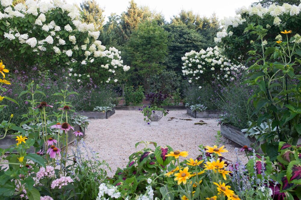
One thing is a given: Color is a subjective subject. Just ask designers, and you’ll get a variety of perspectives. Carleton Varney (dubbed Mr. Color for his energetic use of brights) recommends painting deep tones in small spaces “to add the element of coziness,” he says. Alexa Hampton favors a softer side of the spectrum. Citing one of her favorite browns, Benjamin Moore’s Middlebury Brown HC-68, she says its cool tones “make it very livable and inviting.” But what designers seem to unanimously agree on is that carrying the outdoors right through the front door and to rooms beyond is natural instinct. Barry Dixon created his paint collection based on what he sees around his rural Virginia farm, plucking colors from the garden for walls. “At night, when the sun goes down and I lose the vista, I’m reminded of it all evening long. And then at daybreak, I’ll see that color liaison again—from living room to landscape,” he says. Dixon believes we’ll never be disappointed when we look through windows for inspiration. We concur, and we share some of our favorite shades taken from the pages of Mother Nature’s handbook.

While stems and foliage often play supporting roles to a garden’s big show, they ultimately provide the foundation, nutrients, and energy that allow blossoms to take the spotlight. Greens can do the same for a room, but we love it when they’re center stage. These leafy shades may be inspired by the hard-working parts of a plant, but it’s quite easy being green.
1. Benjamin Moore, Olive Moss 2147-20. 2. Carleton Varney for Fine Paints of Europe, Palm Beach Green. 3. Benjamin Moore, Louisburg Green HC-113. 4. Farrow & Ball, Breakfast Room Green No. 81. 5. Farrow & Ball, Yeabridge Green No. 287. 6. Fine Paints of Europe, WC-60. 7. Benjamin Moore, Cedar Path 454. 8. Barry Dixon for C2 Paint, Viburnum BD 74. 9. Farrow & Ball, Pitch Blue No. 220

In designer Chloe Redmond Warner’s San Francisco bedroom, Farrow & Ball’s Calke Green evokes a walk through the garden from the comfort of her chaise. “This color immediately made my room the most exciting one in the house. A good green paint can really bring a lot of liveliness to a space,” she says. | Photo by Aubrie Pick

Who doesn
’t go wild for big, blousy blossoms and their look-at-me faces? They
’re the life of the garden party. When a peony, rose, tulip, or dahlia begins to wilt and its beauty becomes all too
fleeting, your walls can keep the celebration going with colors inspired by these perennial show-o
ffs. These vibrant shades are sure to brighten any room—and certainly any mood.
1. Pratt & Lambert, Maytime Iris 31-9.
2. Farrow & Ball, Citron No. 74.
3. Pratt & Lambert, Taffy Lips 2-12.
4. Pratt & Lambert, Poppy 6-15.
5. Benjamin Moore, Pink Powderpuff 001.
6. Barry Dixon for C2 Paint, Summer Squash BD 55.
7. Sherwin-Williams, Daisy SW 6910.
8. Benjamin Moore, Caliente AF-290.
9. Farrow & Ball, Middleton Pink No. 245

In a house on Long Island, the ever-chic New York designer Miles Redd enlisted a painter to concoct a color based on Benjamin Moore’s Heritage Red. “I love red
because of its warmth. When you’re in a red room, you feel as if you’ve been submerged into the center of a raspberry soufflé," he says. | Photo by Paul Costello

Even Mother Nature knows there’s a time and a season for peace and quiet. That doesn’t make her palette any less interesting. The tones and textures of sun-bleached stones, shifting sands, and woodsy moss, bark, and pinecones contribute to the visceral—and visual—experience of the great outdoors. Our rooms need a little serenity, too, and these tones bring calm and warmth to indoor living.
1. Barry Dixon for C2 Paint, Cattail BD 48. 2. Farrow & Ball, Elephant’s Breath No. 229. 3. Pratt & Lambert, Almond Toast 7-24. 4. Sherwin-Williams, Pavestone SW 7642. 5. Sherwin-Williams, Sea Salt SW 6204. 6. Benjamin Moore, Cambridge Riverbed 1035. 7. Benjamin Moore, Revere Pewter HC-172. 8. Farrow & Ball, Down Pipe No. 26. 9. Benjamin Moore, Middlebury Brown HC-68. 10. Farrow & Ball, Drop Cloth No. 283

A favorite color of New Orleans designer Gerrie Bremermann, Benjamin Moore’s Papaya is a neutral that packs just enough punch. “Papaya picks up on all of the surrounding tones and reflects them back. It works well with antiques because it’s not too white or too yellow—it acts as a moderator. I’ve been using it for over 20 years,” she says.
Produced by Abby Braswell | Photography by Stephen DeVries
 Putting on a fresh coat of paint and waiting for the still-wet, glossy walls to dry is akin to coaxing a seedling to grow into a full-fledged plant. You’ve done the prep, the hard work, and now eagerly hope to be rewarded with a room or a garden that will bring you joy for many seasons to come.
