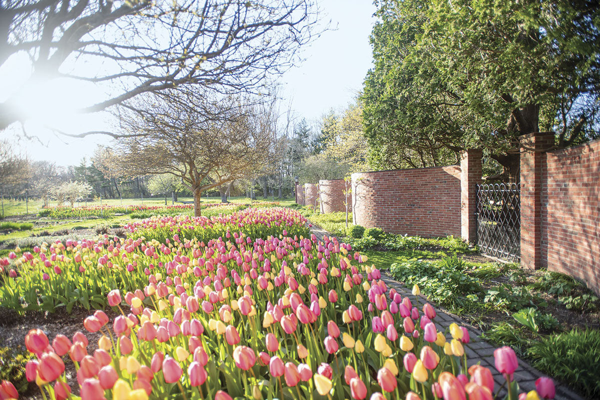
When architect Joseph Everett Chandler designed the Stevens-Coolidge gardens, he added a serpentine wall as a nod to Monticello.
Tim Schipper had a novel idea in 1989 when he composed his first combo of tulips, and the concept has caused many a driver to slam on the brakes ever since. He called that initial blend of scarlet and golden-yellow tulips Hot Hot Hot, and it sizzled in the early offerings of the company he dubbed Colorblends. Strong contrasts in color certainly stop traffic, but subtle is now also in the inventory. Based on his vast experience mingling tulips, Tim shared some of the knowledge he learned.
TIMING IS EVERYTHING
“A combination might look wonderful in theory,” he says, “but if the bloom times do not coincide reliably, it will never come together.” Although tulips are usually grouped as early, midseason, or late bloomers, there is a lot of leeway within those categories. With family roots in the Netherlands bulb industry, Tim works with experts when creating blends. Even so, he trials blends before introducing them in the United States to make sure the bloom times overlap reliably in the climate here.
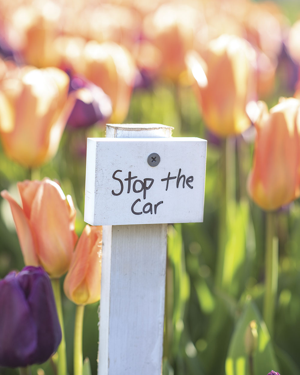
“Stop the Car”—a playful name for a fervent blend of peach and plum tulips
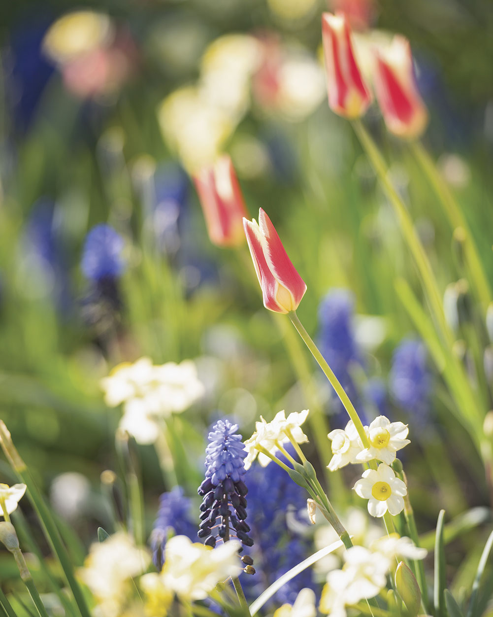
The combo ‘Aladdin’s Carpet’ combines species tulips with muscari and dwarf daffodils.
A DELICATE BALANCE
“For a blend to be magical, it has to be balanced,” Tim says. “I keep coming back to the band analogy. Each instrument playing alone might sound fine, but it’s how a band plays together that is key.” Of course, colors are critical in the composition, but textures and the dimensions of each flower are also vital in a mix. Varying heights are also part of the recipe. Selecting the right formula is very similar to building a bouquet, but you never know if the components will sing until you bring them into concert in the real time of a garden planting.
COLOR CONSCIOUSNESS
Tim tries to offer blends for every taste. But he has also discovered certain criteria that make his arrangements feel like the epitome of spring. “You need an element that pops,” he has found. Often, he uses yellow as the festive shade. “It bounces off everything beautifully,” he says. “It shines.” Darker hues are often added, especially for a sophisticated presentation. “They are like the drums in a band,” says Tim. On the other hand, without a brighter color to offset purples or burgundies, they can easily feel flat. Not surprisingly, Tim is more apt to go for levity rather than austerity. After all, he’s working with a flower that is the essence of joy.
By Tovah Martin | Photography by Kindra Clineff
SOURCES
- Flowerbulbs, Colorblends, colorblends.com
- Gardens, The Stevens-Coolidge Place, thetrustees.org
This story originally appeared in Flower magazine’s Jan/Feb 2021 issue. Subscribe to the magazine or sign up for our free e-newsletter.

